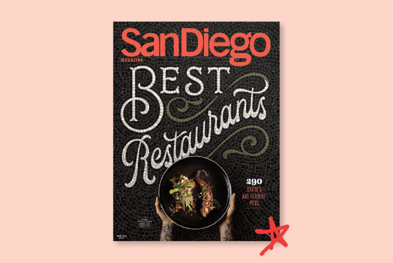
Nick Misani says “the best design comes through collaboration,” and our “Best Restaurants” cover is no exception. Sydnie Goodwin, San Diego Magazine’s creative director, came across Misani’s “fauxsaics” (faux mosaics, created not in a kiln but on a computer) on Instagram over a year ago.
best restaurants behind the scenes
“I wrote him right away to see how we could work together on one of our ‘Best of’ issues,” she says. “Rightfully, he had a bit of a wait list.” Thankfully we arrived at the top of his queue just in time for this issue. Designing the faux tile pattern on this month’s cover took two months from start to finish.
best restaurants behind the scenes
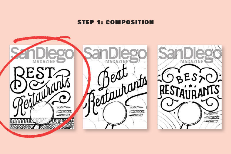
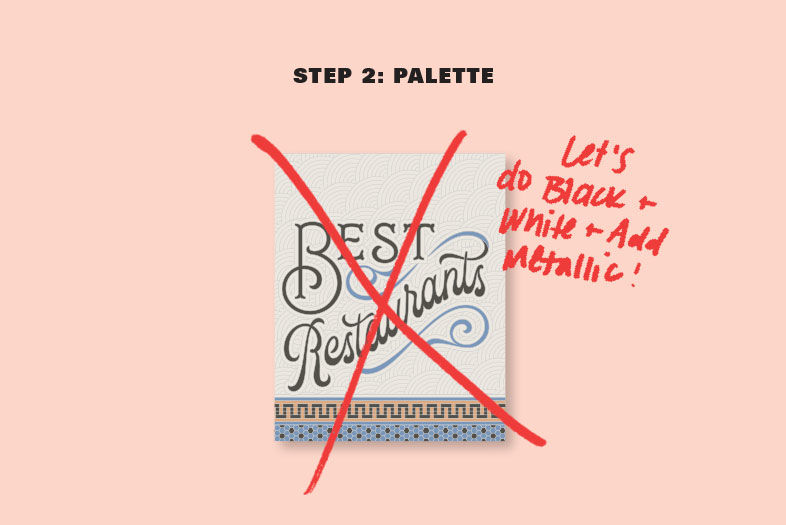
Step 1: Choosing the text placement and style, or composition. Then came the color (step 2). We pivoted from blue to black, because as Goodwin explains, “the darker the background, the greater the impact of our cover model: the dish.”
behind the scenes best restaurants
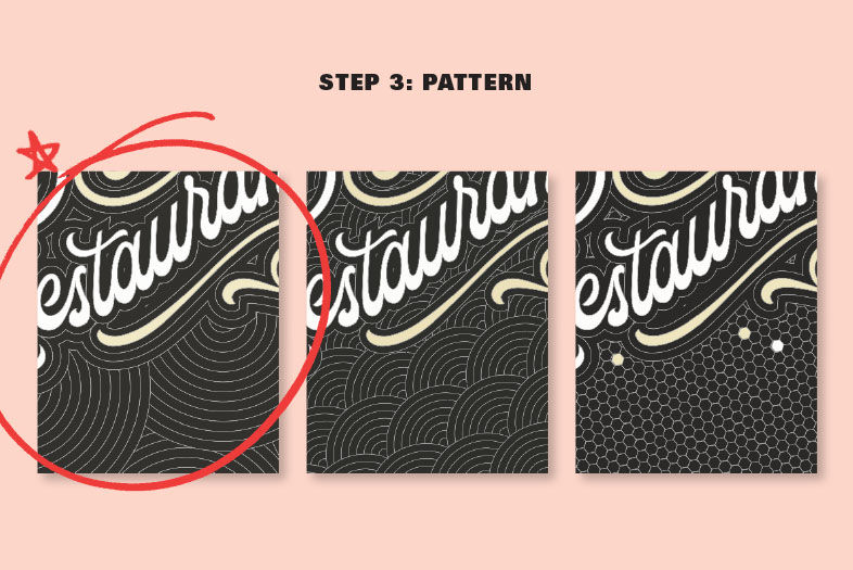
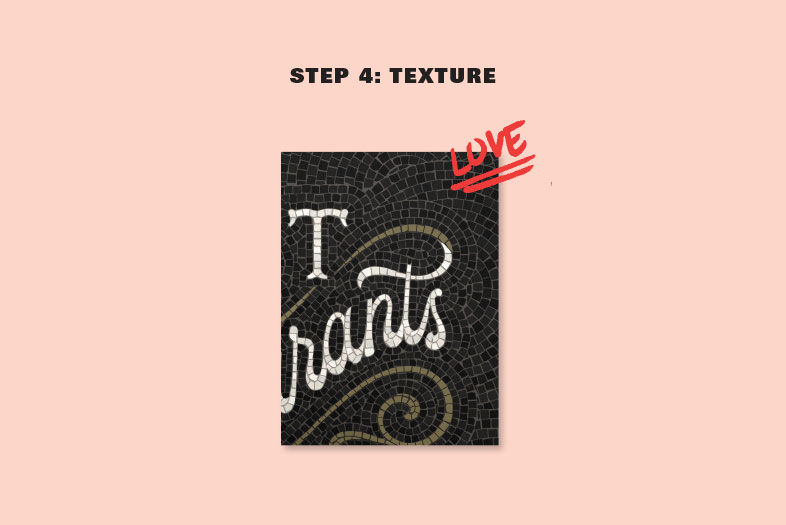
As for pattern (step 3), we had a trio to choose from—hexagonal, fanned, or overlapping circle, and the latter won out. Misani then placed each tile individually to achieve that textured—and realistic—look (step 4).
“Usually historical reference is my first place to go for inspiration,” he says. “There are so many beautiful mosaics that grace old train stations, hotel lobbies, and storefronts. I also try to add something new or unexpected.”
Behind the Scenes: Just Faux the Cover
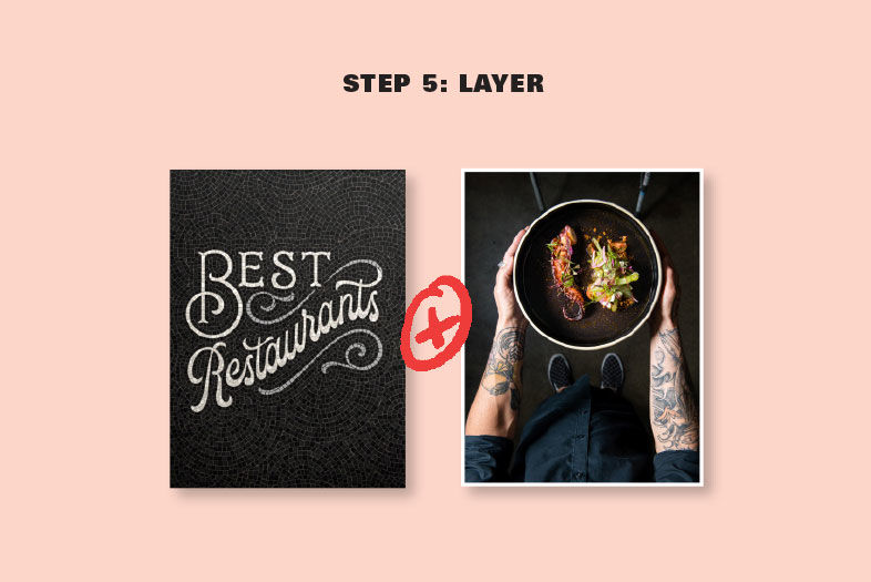
That’s where Goodwin came in (step 5), popping in a photo of the Spanish octopus at Death by Tequila. Finally, the edit team added the cover line: “290 Critic’s and Readers’ Picks.” Devour them all.
Behind the Scenes: Just Faux the Cover

PARTNER CONTENT
Behind the Scenes: Just Faux the Cover
