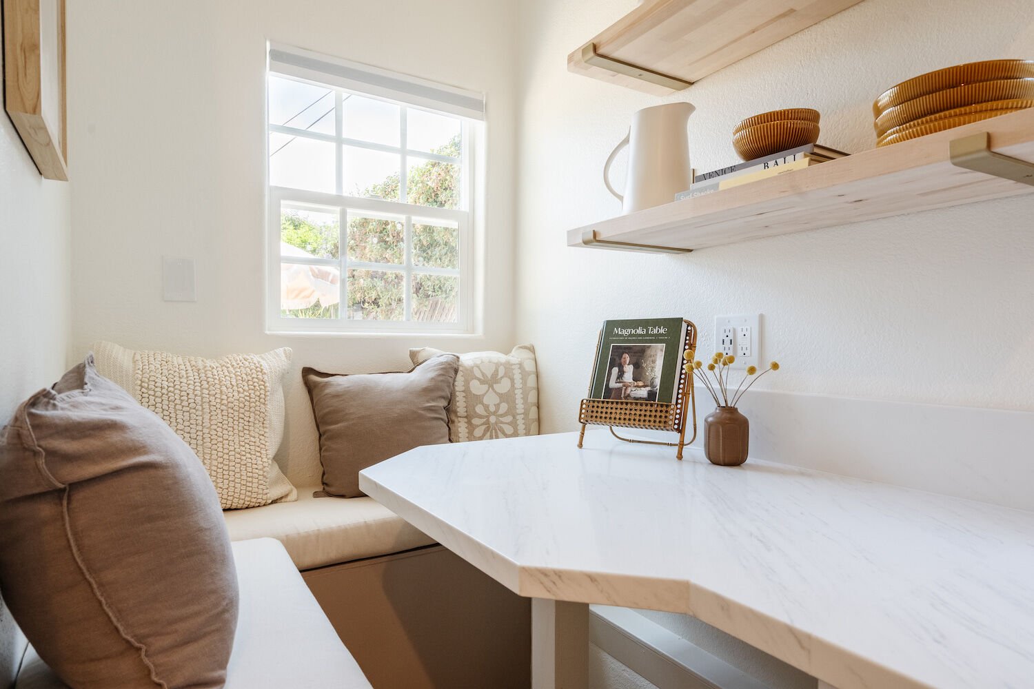
Courtesy of Boho on a Budget
I recently cried in an Ikea.
It wasn’t my finest moment, fighting tears while a kindergartener bounced on a display mattress two feet away. My girlfriend and I are moving in together for the first time, and I found myself feeling unexpectedly overwhelmed—obviously, love conquers all, but combining two peoples’ lives into a 680-square-foot one-bedroom (and making it look as cool as we are) is tough.
And as much as I’d like to call up whoever put a ball pit in Cara Delevigne’s house and ask them to turn our place into a miniature version of the revamped Lafayette Hotel, that’s not exactly in our budget. (Also, we’re renting.) So I did the next best thing: I tapped four local interior designers for their best storage solutions, favorite renter-friendly décor hacks, and top tips for giving tight spaces personality on a dime.
Here’s their advice for small-space decorating on a budget in San Diego.
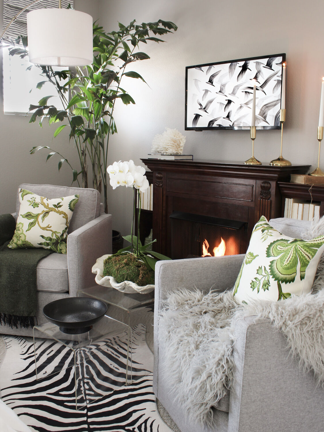
Courtesy of Oscar Bravo
Identify Your Personal Taste & Buy Accordingly
“When someone first starts designing their place and they don’t really know what their style is, they jump into what the trends are,” says interior designer Nicola Hopwood. “They go on social media and do what everybody else is doing. But if they just follow trends, it’s not going to feel like home.”
She notes that clues to what you genuinely love can be found close at hand: Peek into your closet to learn what colors you’re drawn to. Consider your hobbies and lifestyle to figure out what functions your furniture and décor need to serve. (If you entertain often, for example, you’ll need more seating than someone who usually meets their friends for lunch.)
Ultimately, you’ll save money by choosing not to keep up with the trend cycle and instead filling your space with items you truly love—which requires patience and time. “[It’s] not going to happen in a two-day shopping spree,” Hopwood says. “Everything you buy, no matter how big or small, is like a puzzle piece that contributes to your unique home.
”And if you (like me) are worried that simply going with your gut will result in a houseful of items that don’t play well together, Hopwood has an easy tip for ensuring your collection doesn’t get too eclectic: “Go in with a color palette. Use that as a guide when you’re picking things, and it will all end up coming together.”
Remember that items don’t have to be an exact color match—in fact, a green-and-orange rug, for example, looks best set against throw pillows in slightly lighter or darker shades.
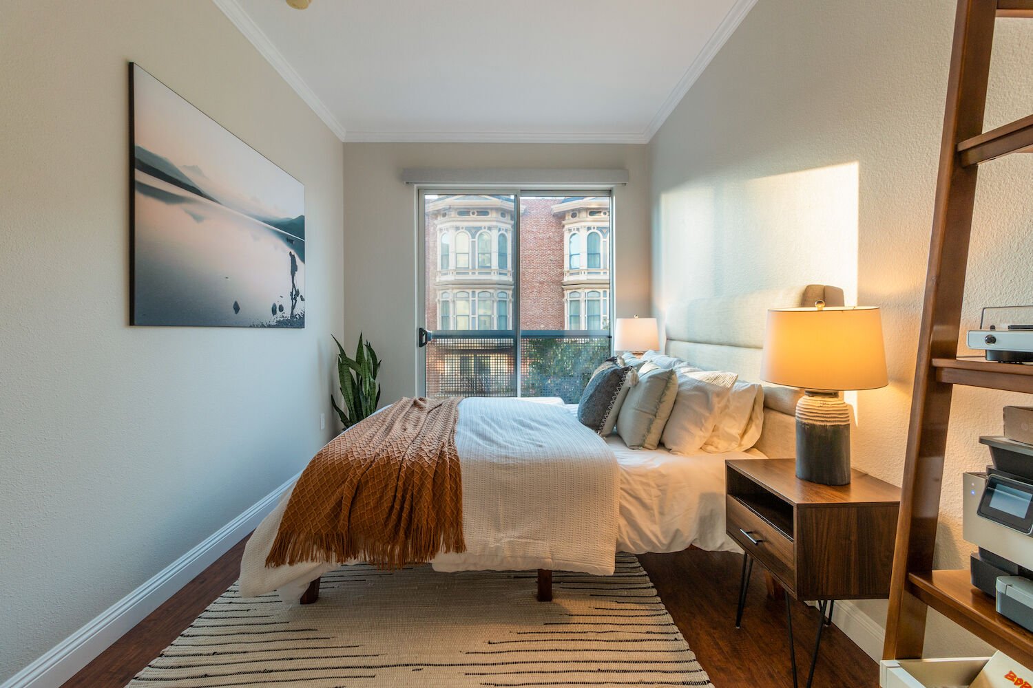
Courtesy of Nicola Hopwood
Spend Where It Counts
The designers I spoke to all said the same thing: Invest in your sleep. “The right mattress is something you’re going to have for years,” says local interior designer Elizabeth Aaron. Once you find your ideal one (Firm or soft? Cozy or cooling?), “you better buy a mattress protector,” Aaron continues. While it may seem like an unnecessary purchase, it can dramatically expand the life of your mattress.
Spend a little more outfitting your bed, too. “You can’t really find nice linen bedding for cheap,” cautions Jordan Miranda, founder of affordable design firm Boho on a Budget.
Follow similar guidelines for anything that you’re going to be spending a lot of time curled up on, like couches and chairs (including desk chairs). “You want to avoid buying cheaply made furniture for these times, because you’ll need to replace them multiple times in the lifespan of better-quality furniture,” Hopwood says. “Over time, you’ll end up spending more money.”
You can save on less-functional décor pieces. “You don’t have to spend a bazillion dollars on an area rug you’ll love,” Aaron says. She recommends the brand Surya for a range of budget-friendly rug options. When searching for art, wall hangings, coffee table books, and other fun details, explore local boutiques like Pigment, Botanica Home and Garden, and Solo for relatively affordable pieces that add personality and depth.
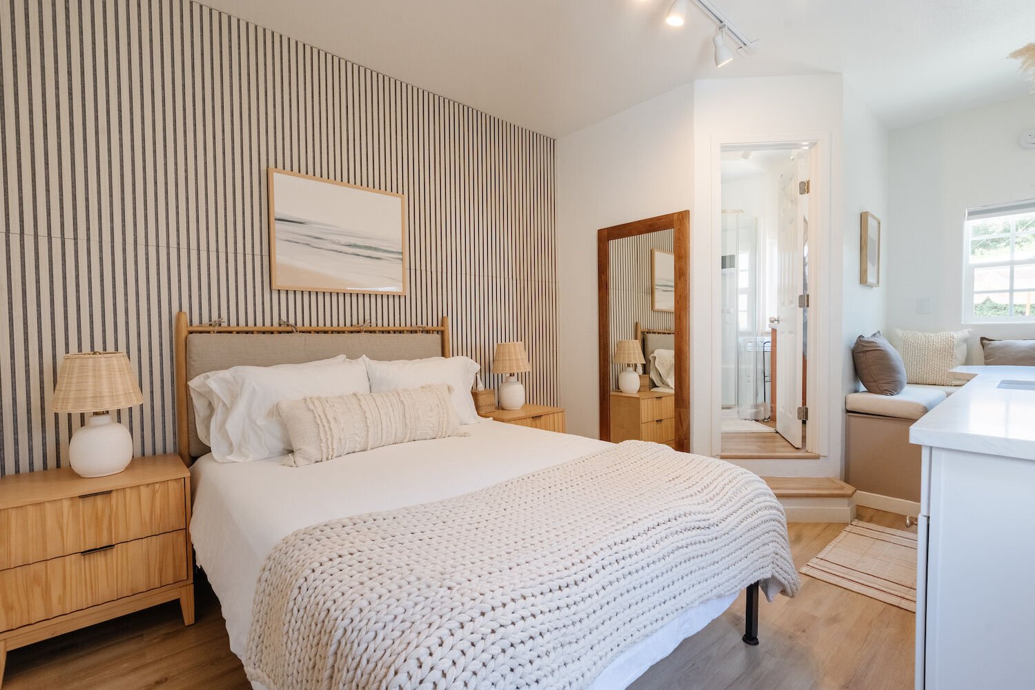
Courtesy of Boho on a Budget
Consider Construction
Even when it comes to budget furniture, not all couches are created equal. “Any upholstery, you want to make sure you’re getting performance fabric,” Aaron says. “It’s a hundred percent polyester, and it’s bulletproof”—unlike linen textiles that show stains and pet scratches.
Try to determine what’s going on under the surface of potential buys. More durable couches and chairs are constructed with high-density foam. “As much as you think you want a squishy sofa, the sheet foam that’s not high-density is going to break down and you’re going to be left with a lumpy sofa,” Aaron continues.
Similarly, when it comes to items like dining tables and nightstands, “look for plywood frames as opposed to particle board,” Aaron suggests. “Particle board is flimsy, and it’s going to disintegrate on you.
”When shopping on resale sites like Craigslist, Facebook Marketplace, and OfferUp, hunt for deals on solid-wood furniture. Since low-cost “wooden” furniture tends to be veneered, it doesn’t stand up well to spills or condensation-covered glasses, which will cause the veneer to peel or warp.
Real wood, on the other hand, will stand the test of time—budget-friendly interior decorator Oscar Bravo purchased a friend’s solid-wood dining table for $40 more than 20 years ago and “it’s still in perfect condition,” he says. If you find a sturdy piece but don’t love the look, remember that you can sand and stain it and replace elements like drawer pulls to help it match your style.
Courtesy of Nicola Hopwood
Alter the Architecture (Without Losing Your Security Deposit)
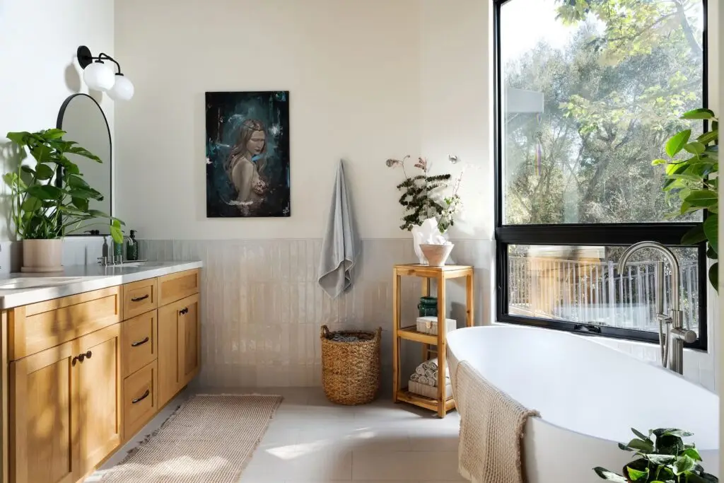
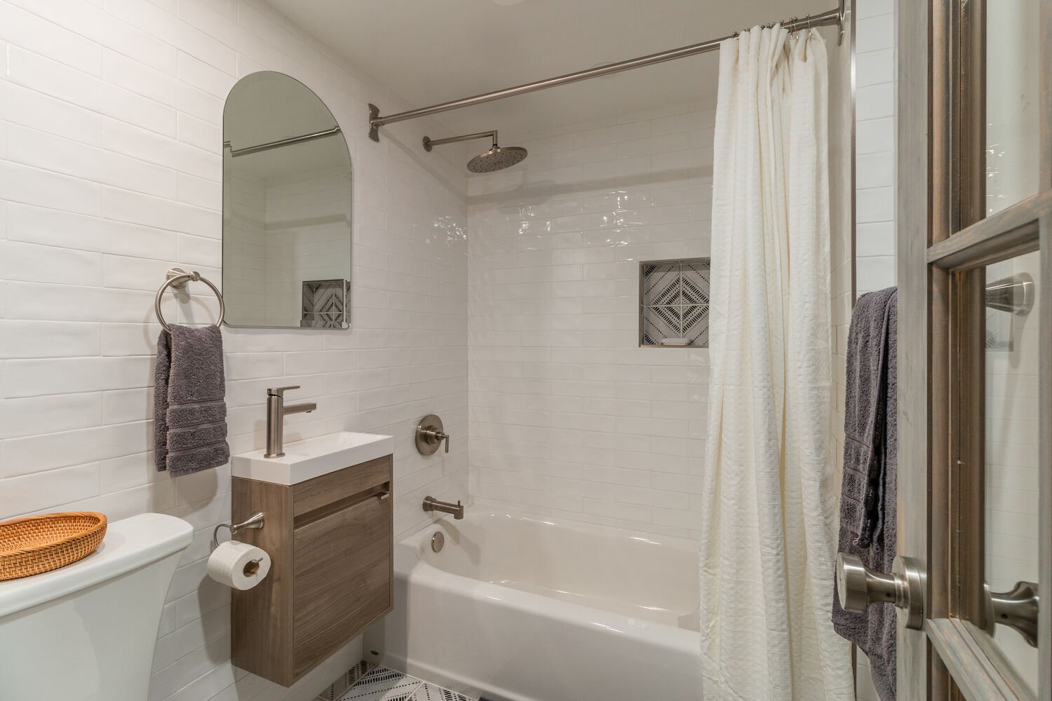
There are plenty of simple tricks to make teacup-sized spaces feel grander: A large mirror (though not too big, Hopwood cautions, since a glut of oversized mirrors sometimes make small rooms “feel like a gym”) can create the illusion of more space. And floor-to-ceiling curtains, Hopwood adds, help ceilings appear taller.
If you’re up for a bigger project, Bravo says that you can transform a cookie-cutter apartment with elements like peel-and-stick molding—especially if your lease allows you to paint. You can purchase relatively inexpensive kits designed for DIY wainscoting, paneling, tiling, or molding. When put up and painted over, they look like a built-in detail.
Scones can serve as a softer source of light than overhead bulbs while making your space appear customized (and expensive!). To avoid any tricky hard-wiring, look for battery-operated wall sconces, or make your own by attaching remote-control puck lights to a bulb base adapter.
Courtesy of Elizabeth Aaron
Avoid Clutter, Including the Sneaky Kind
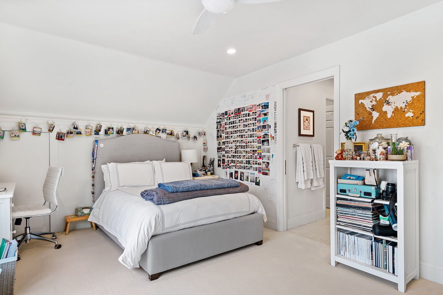
Apartment living requires a certain minimalist sensibility—in a 600- or 700-square-foot space, there’s simply not much room for stuff. But according to the designers, you can Marie Kondo everything you own and still feel like you’re surrounded by clutter if your furniture is too large or attention-grabbing.“The goal is to show more of the floor, which creates [the impression of] more space,” Hopwood says. Floating bookshelves and coffee tables with slim legs, for example, will make rooms feel more open.
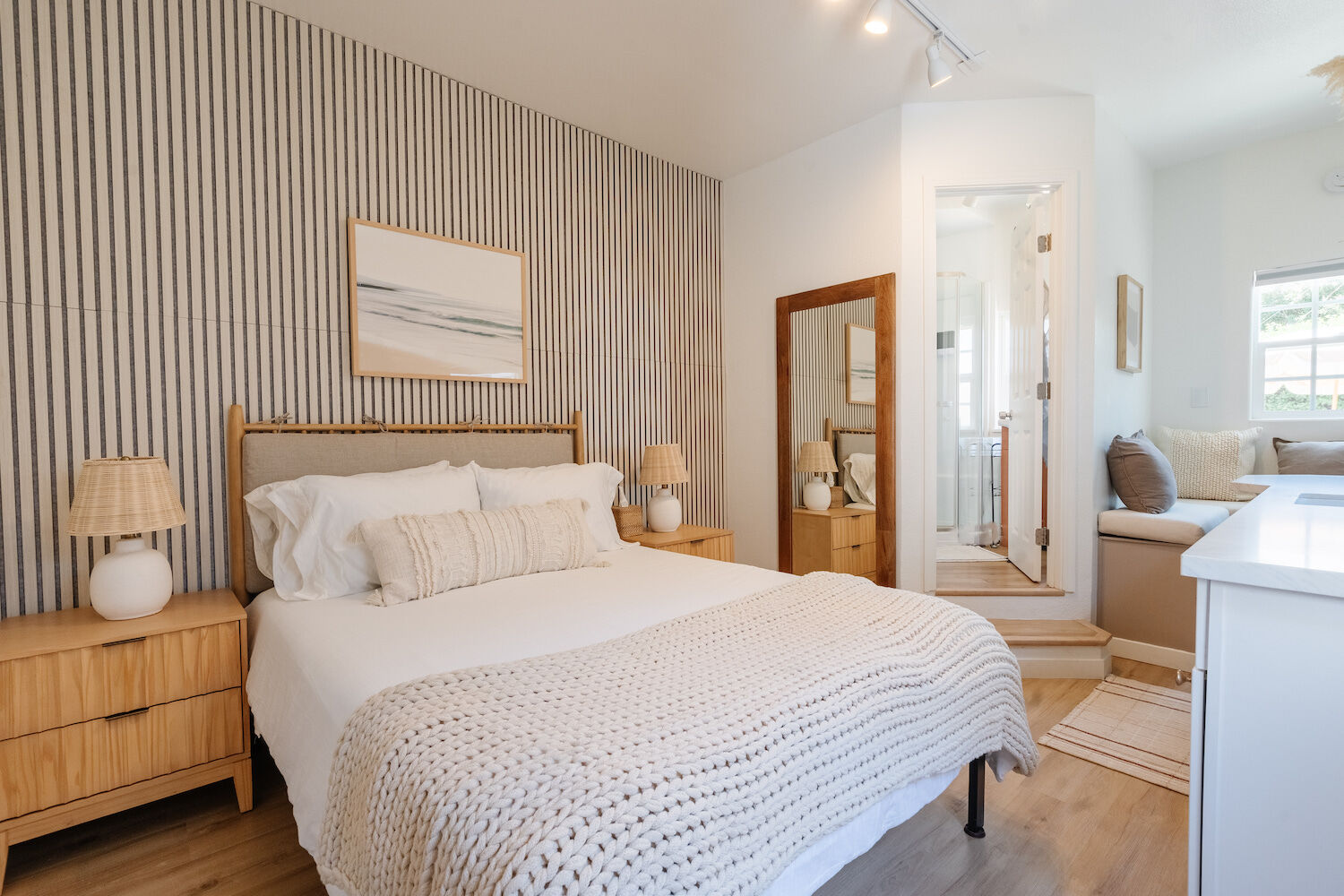
Miranda says that you can also reduce clutter by sourcing furniture that plays double-duty. A storage bench at the foot of your bed, for example, can hold games and blankets while bringing in additional seating.
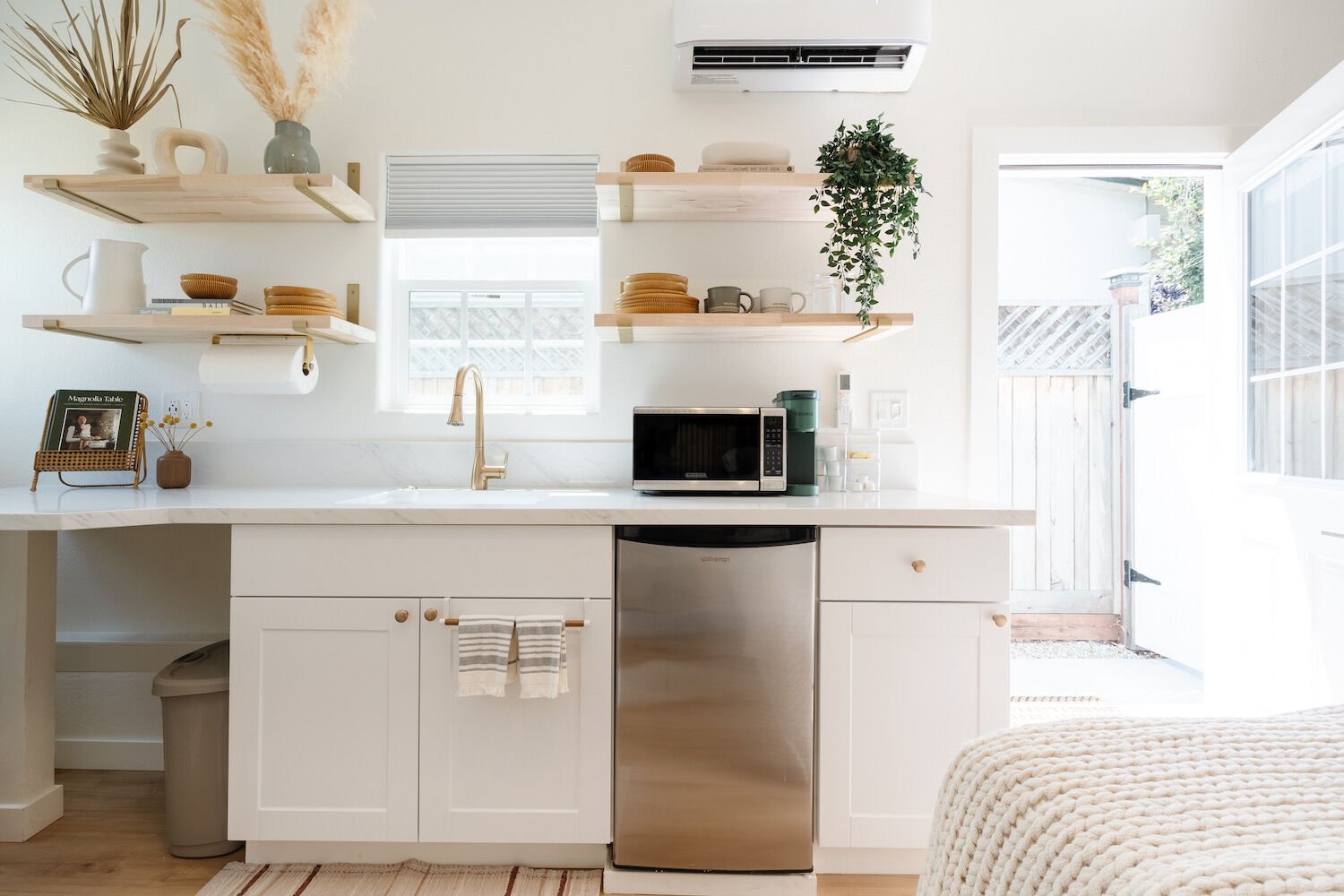
Finally, ensure surfaces don’t look too busy. You can keep everyday essentials off of tables and counters by “[bringing] in worker baskets and visually appealing storage pieces,” Hopwood says, adding that lesser-used items can lurk in underbed bins, cloaked by a floaty bedskirt. (“A skirt that is very structured and [made from] a thick material still brings that element of bulk,” she explains.)
Courtesy of Boho on a Budget
Size Matters
You’ve probably seen photos online of eclectic gallery walls packed with playful art of different shapes and sizes. They’re super cute—but not ideal for small spaces. “They tend to look a bit cluttered, especially in smaller floor plans,” Bravo explains. While it may seem counterintuitive, large-scale, poster-sized art can make your space feel more expansive.
Websites like Drool, PSTR Studio, and The Poster Club offer affordable, funky prints with more of a point-of-view than your old Pulp Fiction poster from college. Or get even more creative: In his own home, Bravo wallpapered the inside of three mega-sized frames. “It’s really a statement, and it looks expensive because of the size,” he adds.


