

Boost to your brand by enhancing your customer base, expanding your outreach, and increasing your influence. We believe in keeping the creative process enjoyable, and that's why we bring cookies to meetings.
Featured articles
Food News
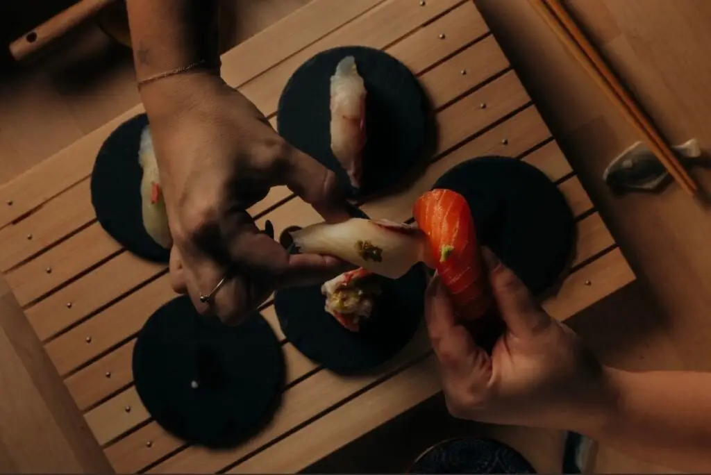
Omakase Inu Combines Japanese Techn...
Food & Drink
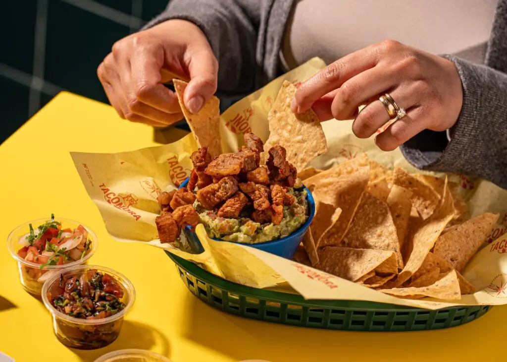
A New Taquería Puts the Spotlight ...

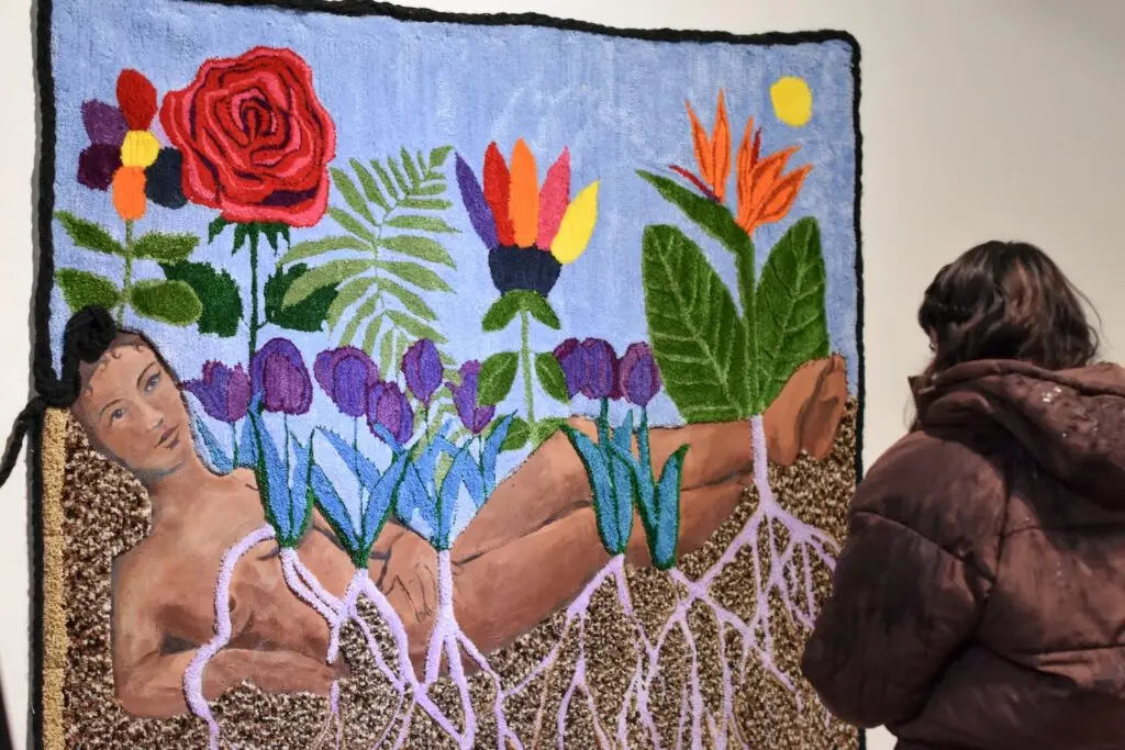
Things to Do
Where to Celebrate St. Paddy's Day ...
Featured articles
Things to Do
17 Things to Do in San Diego This W...

Everything SD
6 San Diego Charity Events to Atten...
Things to Do
The Best Things to Do in San Diego:...
Featured articles
Things to Do
17 Things to Do in San Diego This W...

Everything SD
The Locals' Guide to Visiting La Jo...
Things to Do
Where to Celebrate St. Paddy's Day ...
Featured articles
podcast-ep
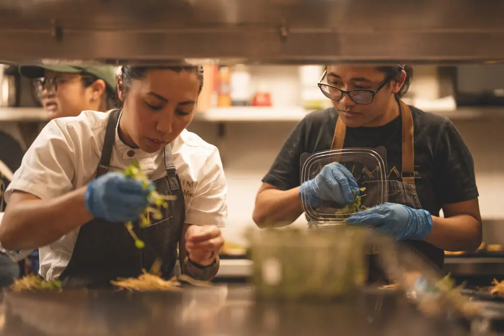
James Beard Nominee Tara Monsod on ...
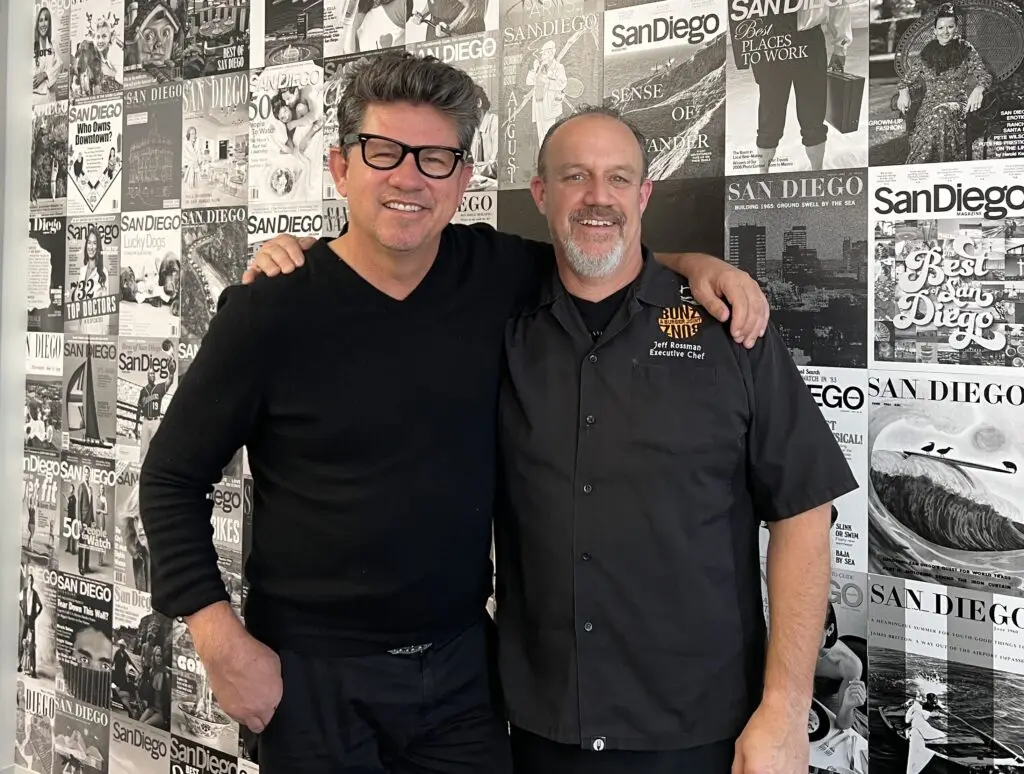
podcast-ep
The Secret Spot Serving Affordable ...
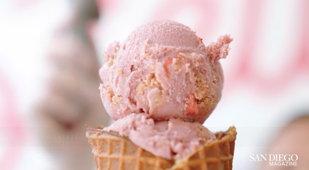
video
SDM Guide to Food + Drink: Stella J...
Featured articles
Everything SD
The Locals' Guide to Visiting La Jo...
Features
Editor's Note: Desperately Seeking ...

Everything SD
How Makeda "Dread" Cheatom Shaped S...
Featured articles
Things to Do
17 Things to Do in San Diego This W...
Food News
Omakase Inu Combines Japanese Techn...

Partner content