Photo courtesy of Blythe Interiors, @blytheinteriors
The fastest way to refresh a room is with a can (or two) of paint. But choosing a color can be overwhelming, since there are thousands of options. Even if you’ve zeroed in on a hue—and a brand—there may be a dozen or more nuanced tint in the same family, which can make it very difficult to make a confident decision.
Whether you’re looking for a timeless, calming neutral or a bolder statement shade, the following colors are faves among the pros.
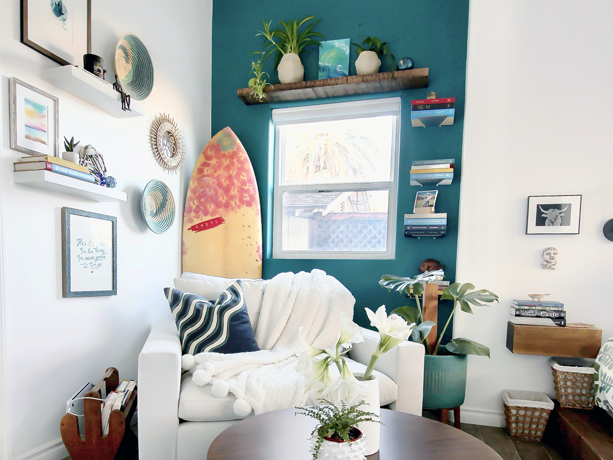
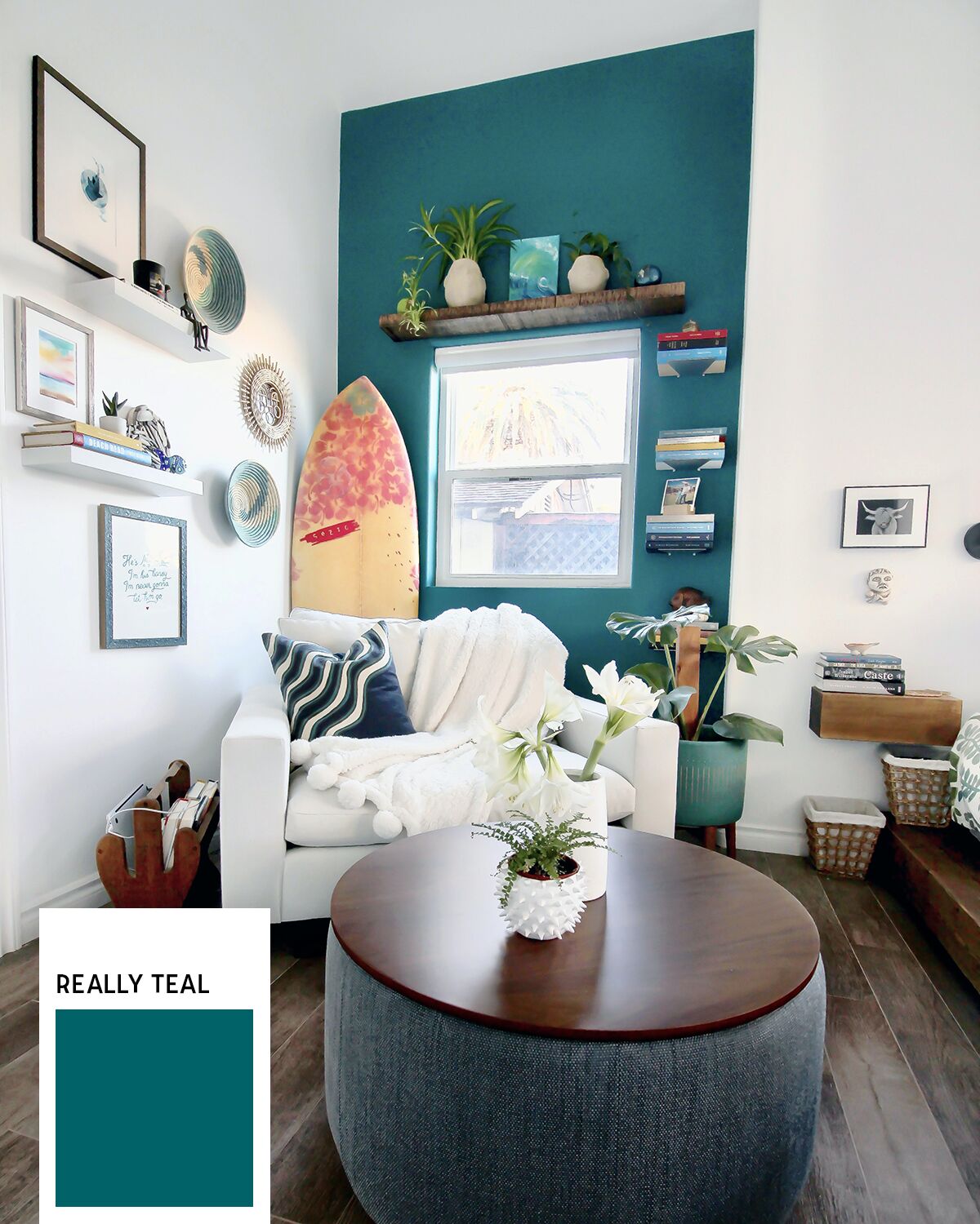
Really Teal, Sherwin-Williams
Bright, fresh, and cheerful is what Jennifer Verruto, the founder and designer-in-chief of Blythe Interiors, aims for when she’s trying to define a small space. “Originally, this inset corner didn’t seem to have a purpose,” Verruto says. “Giving it this vivid pop makes the new reading nook feel intentional.”
Naval, Sherwin-Williams
“I’m obsessed with this color because it’s timeless, bold, and adds richness and depth to a room,” Verruto says of the color she chose for her son’s nursery. Worried that a shade this dark will make a room feel too small? She adds, “As long as there’s a lot of natural light and large furnishings to break up the color, the room will feel cozy, not small.”
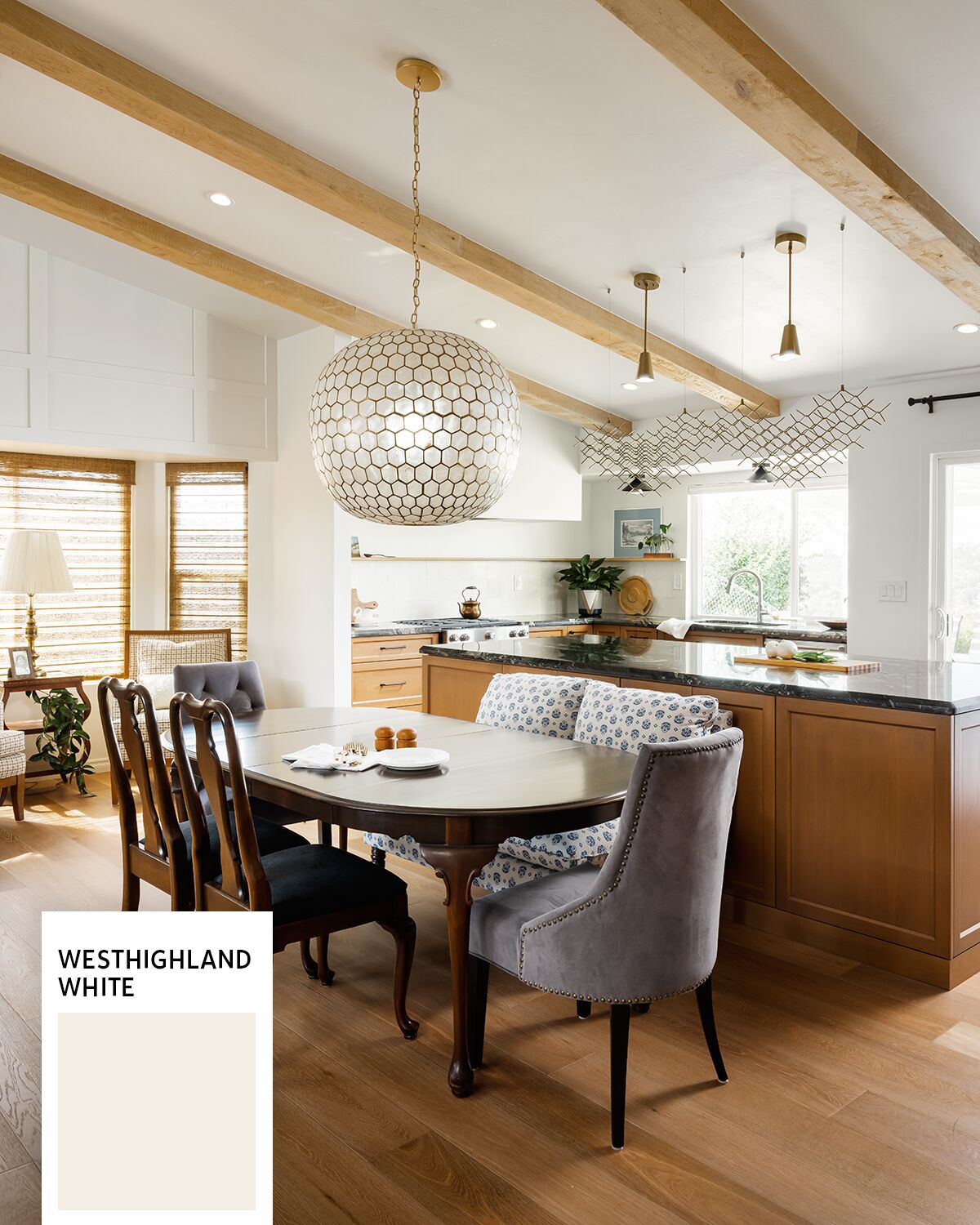
Photo courtesy of Taylor Abeel, @taylorallancreative
Westhighland White, Sherwin-Williams
Danielle Perkins, principal designer and owner of Danielle Interior Design & Decor, says everyone wants white walls: “This warm white feels welcoming in a room that has lots of natural light. If you use it in a room with little light or no windows, it may show more yellow.” She used this paint throughout an open space—including on the ceilings—to let the woodwork steal the show.
Alabaster, Sherwin-Williams
For spaces with no windows, Perkins opts for this cooler shade in almost every instance. “It never lets me down,” she says. Here, she chose lighting that casts a warmer glow to ensure the space doesn’t look stark.
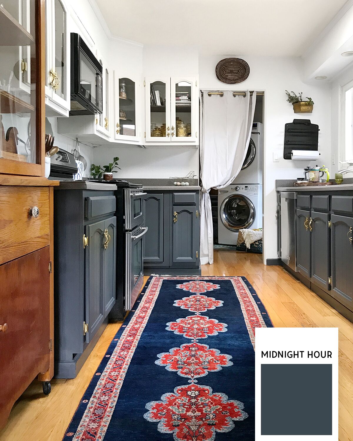
Photo courtesy of Rachel Moriarty
Midnight Hour, Glidden
Charcoal works as a neutral, explains Treci Smith, the interior stylist behind Treci Smith Designs. Use it anywhere—inside or out. Smith painted her fence, her studio, and multiple spaces inside her home with this dark gray. “It’s sophisticated and moody,” she says. She likes to be dramatic and paint smaller spaces—like her kids’ bathroom—but she’s used it in rooms with loads of natural light, too. She updated her bright, all-white kitchen by painting the bottom cabinets this color.
Silver Satin, Benjamin Moore
Gray is still considered a classic neutral for interiors. “And this is the perfect gray—not too light or dark, not too cool or warm,” says Hope Clark, founder and principal designer of Olive + Oak Interiors. “It’s the right pigment to create a hint of contrast with white trim.”
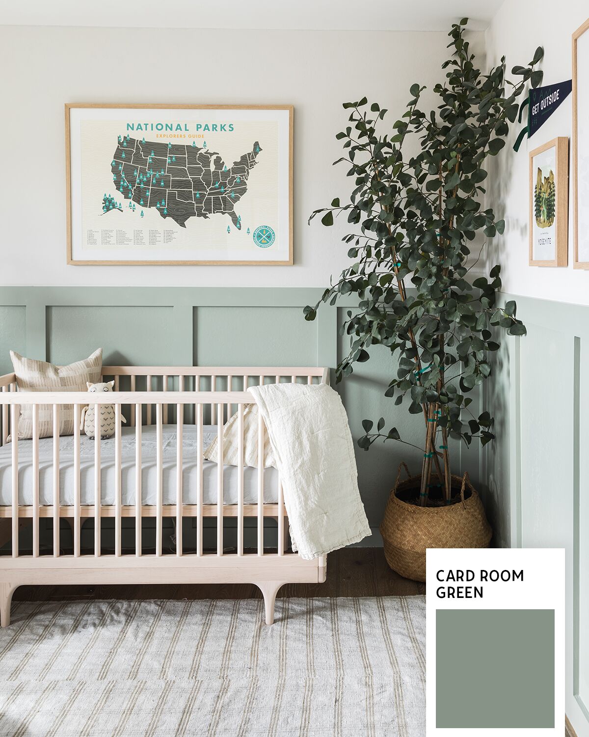
Photo courtesy of Vanessa Lentine Photography, @vlentine
Card Room Green, Farrow & Ball
Soothing colors that celebrate natural elements, like this soft green, are popular this year. “I love this subtle nod to mother earth,” says Clark, who used it on the woodwork in her son’s nursery but brightened the color 25 percent. “It creates such calm.”
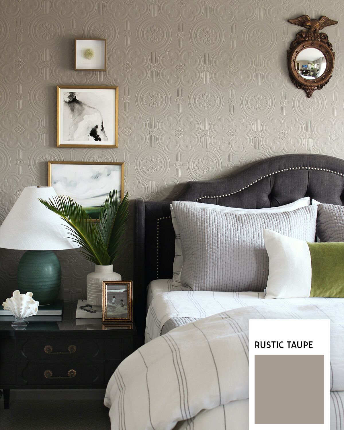
Photo courtesy of Oscar Bravo Home for the One Room Challenge
Rustic Taupe, Behr
Oscar Bravo, of Oscar Bravo Home, likes a good gray—but prefers the warmth of this taupe that almost looks gray. “It works well in rooms that don’t get a lot of light,” he says. “The common misconception is to pick a bright color in dark rooms, but that can make the space appear dreary.” Instead, he likes this saturated hue that makes his guest room (he painted textured wallpaper) feel cozy and elegant.
PARTNER CONTENT
Wendy Manwarren Generes was the editorial director of San Diego Home & Garden Lifestyles magazine. She loves DIYing and hunting down vintage finds. Find her on Instagram at @wmanwarren.
