Defining Spaces
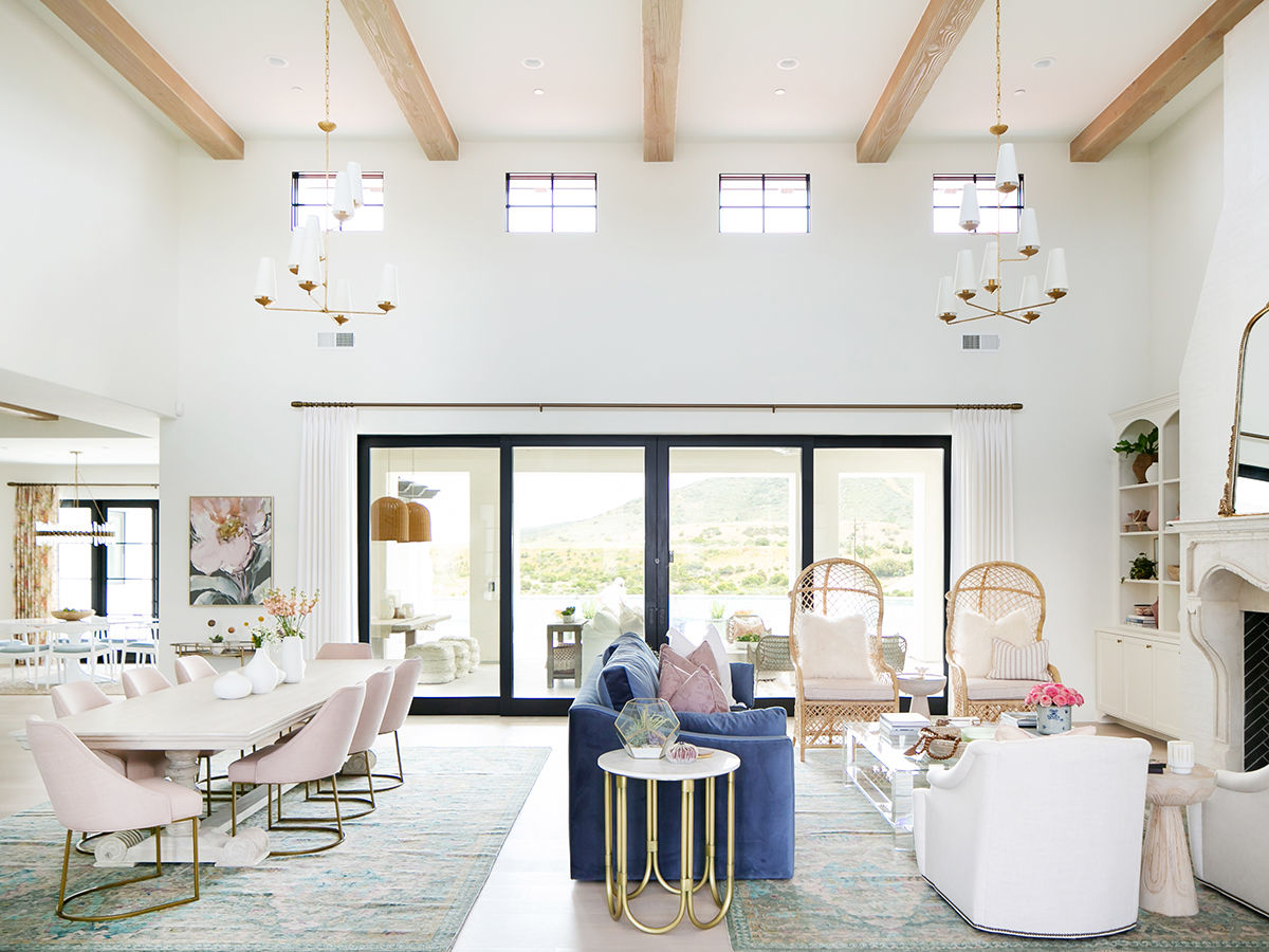
As with any open concept, this room needed its spaces defined. The two area rugs from Kravet help do that—grounding the lounge and dining area. The teal, blush, and green colors in the antiqued fabric directed the rest of the room’s color palette.
A Plush Divider
With a baby and three dogs residing here, all fabrics and finishes were chosen to be “bulletproof,” Weller says. Hence, why the couch from Ultimate Furniture is upholstered in Perennials Velvet, though she adds that the choice for a standard couch over a sectional is a little more elegant. Thanks to the navy color, she also forwent her usual trick for a freestanding couch—placing a console table behind it to mark the end of the lounge area. “The color divides the space enough.”
But Make It Boho
The most explicitly bohemian furnishing is, of course, the wicker chairs. Both are from Noir Furniture, and the fluffy pillows glam up the seating. In a way, the two chairs are the entry point to more bohemian trappings that pour out of the sliding glass doors and into an outdoor lounge area that’s complete with pouf seating and anchored by woven lanterns.
Great Room Envy — Fireplace
Ryan Gavin
The Focal Point
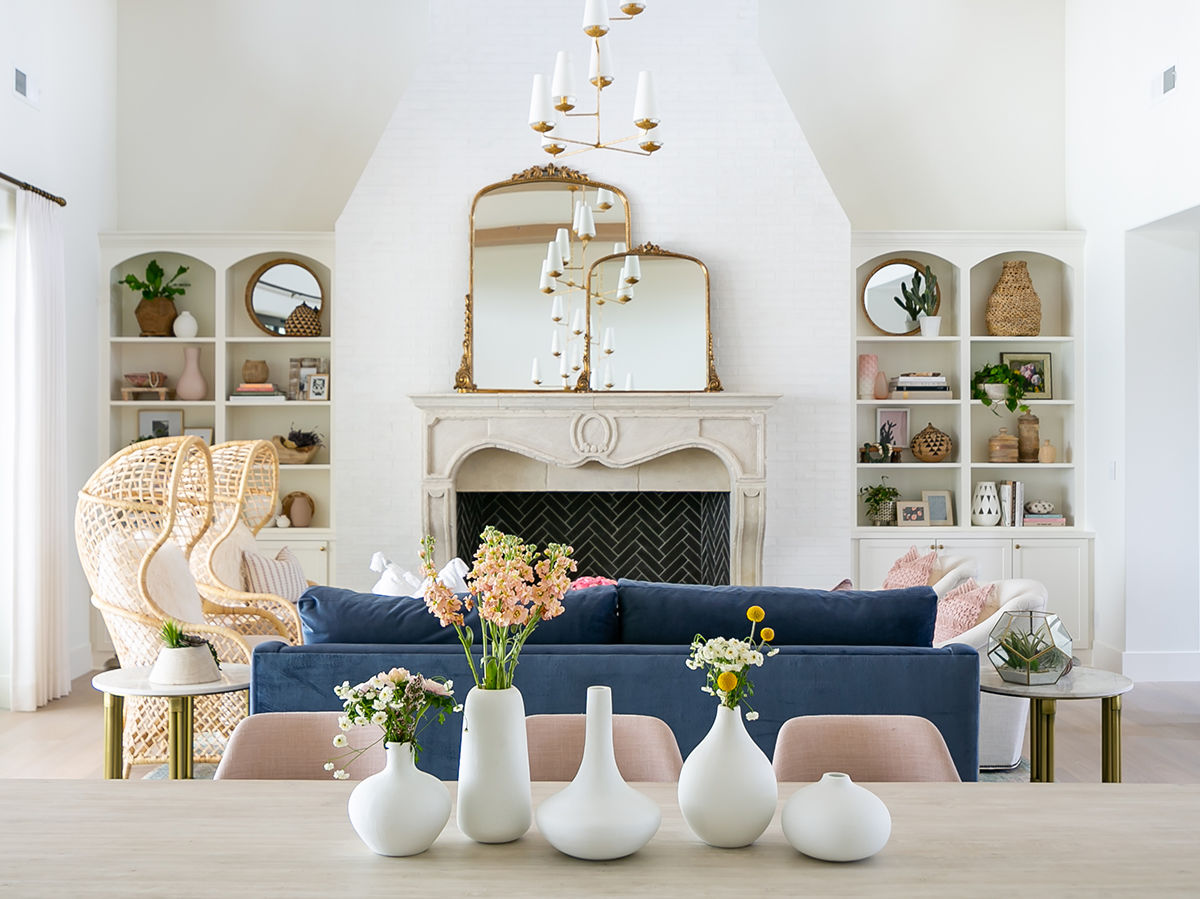
The intended effect when you walk into the great room is “all eyes on the fireplace.” “When the [blueprints] were brought to me, the fireplace did not look like that; it was a big box,” Weller says. She helped overhaul those plans almost entirely into what you see today: a grandiose fireplace reminiscent of the French countryside. A white brick overlay crawls up the back wall to the ceiling for a weathered look. The mantel was custom cast by Mulvey Custom Builders and adorned with Old World details (note the circle and swoops on the face). Inside, it’s all black brick for a modern twist. The Anthropologie mirrors cover a TV, and the gold finish blends effortlessly with other glamorous accents.
Ceiling Styling
The challenge of working in a planned community is most of the homes look the same. In Santaluz, that style skews Mediterranean. Accordingly, the beams are typically very dark. Weller wanted them lighter for this project. “I almost wanted them to resemble the floors, a French white oak,” she says. “It was just taking the architectural integrity of the home and changing it a little.” Another part of that was filling those high ceilings with chandeliers. Both are from Circa Lighting and gleam high above the designated lounge and dining areas much like in a ballroom. Elegant indeed!
Let It Be Light
The dining table is from Custom Furniture & Cabinets. The choice of a lighter timber connects the table to the mantel, and the blush dining chairs from Essentials for Living add another feminine touch.

Great Room Envy — Feature
PARTNER CONTENT
Ryan Gavin

