Can’t Read Your Menu Marisi Dark Interior
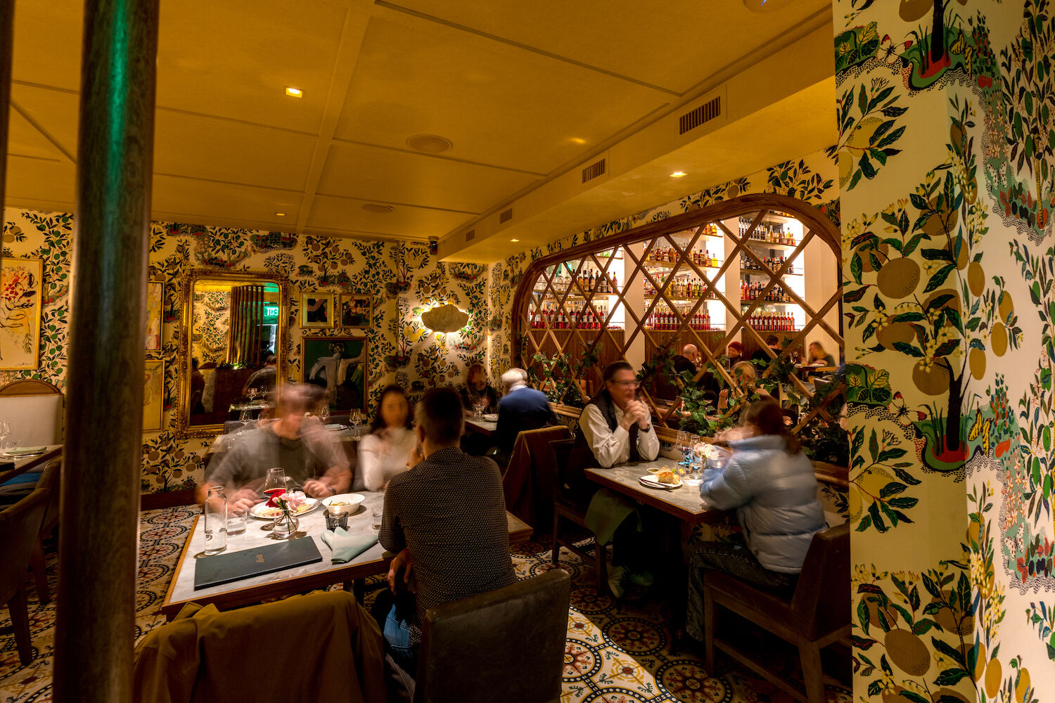
I feel so romantic, and I can’t read your menu. The candles on your tables have really put my wife and me in the mood. The mood for love, yes. But also for Lasik.
I have large pores, but thanks to your restaurant’s magical twilight, no one can see the aerated lawn that is my face. I’m no Chris Hemsworth. I’d need different lights and parents for that. But your eternally lusty dusk is hiding the major, top-line features that scream, “HE’S NO CHRIS HEMSWORTH.”
Does that word here say marinara or Marina? I used to know a Marina. She wasn’t kind. I do not want to eat her pasta, or one named after her.
Is the font on your menu 4.7 points? I’d recognize a good 4.7 font anywhere. I get it. Big lettering is gaudy and cheap. Big font is basically the Truck Nutz of menus, used by restaurants whose business model is to deep-fry everything and serve Long Islands in paint buckets.
You’re not that place. You serve scallops. Scallops are refined, small-font food. Scallops are so refined that you shouldn’t even put them on the menu, just occasionally have a chef lean out of the kitchen door and whisper their presence. At least I think they’re scallops. Does this say scallops?
Facebook’s privacy policy also had a small font. So did this Ponzi scheme I just signed up for. In retrospect, I probably should’ve read both of those. Does this say gluten or Putin?
I don’t have cataracts. But somewhere around age 40, my eyes went from regular, good eyes to the kind of eyes that feel like they’re low on battery and need to be plugged in.
So maybe this is me. But unless you can make my eyes better eyes, why don’t we just, for now, make a menu that’s easier to read? And maybe get a light. Not a big one. Perhaps one of those small reading lamps you clamp to books so you don’t wake up your spouse while reading in bed. Your spouse is already dealing with enough, on account of you not being Chris Hemsworth.
PARTNER CONTENT
Anyway. Thank you. I’ll take the peers and arubula fleshbread.

