SDM past covers
Over the span of 75 years, San Diego Magazine has produced more than 800 covers. From early illustrated classics of the ’40s and ’50s to fever-dream Photoshop nightmares of the early ’00s, we’ve run the gamut from timeless to outright cringe.Our editors have spent a lot of time in the archives as we celebrate three-quarters of a century of SDM, and looking back at old covers has become a favorite pastime in the office. Some we love so much we might use them as tattoo inspiration, and some we’re downright embarrassed by. But good or bad, all of them are a part of the long, strange, dynamic history of this magazine and this city. And they’re really fun to explore.So in an effort to show our blemishes and our beauty over the years, we asked our editorial staff to name a high and a low from our cover archives.

San Diego Magazine Cover September 1963
Chosen By: Amelia Rodriguez, Associate Editor
September 1963
The early ’60s brought a spate of beautiful, stylistically experimental illustrated covers at SDM. This one stamped bold, sketchy lines over a reproduction of, according to the cover blurb, a “delicious, bouncy nude” (oof) by François Boucher. Fascinatingly, I can’t find this particular Boucher anywhere. Cue the research rabbit hole.
October 1968 San Diego Magazine Cover
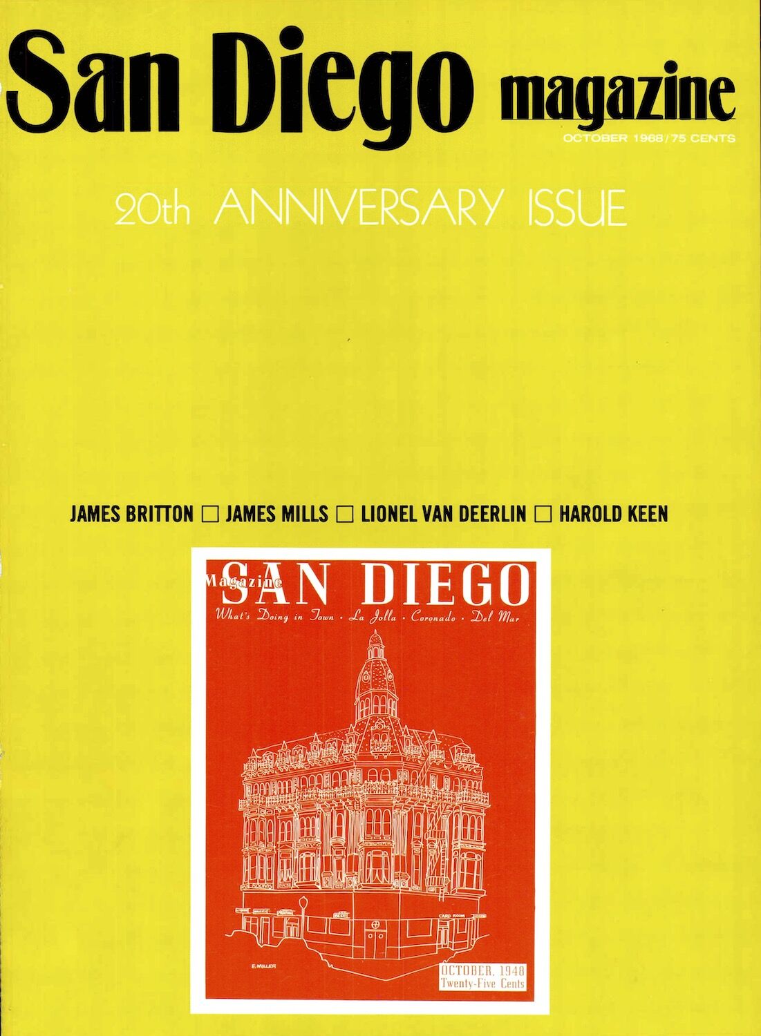
October 1968
Surely all our milestone years were commemorated with the same jubilant decadence captured on our current cover, right? Uh, no. We rang in two decades of SDM with the excitement of eating dry toast while perusing a microwave user guide. Lots of blank space, some dudes’ names… yippee, I guess. Could’ve at least added a balloon.
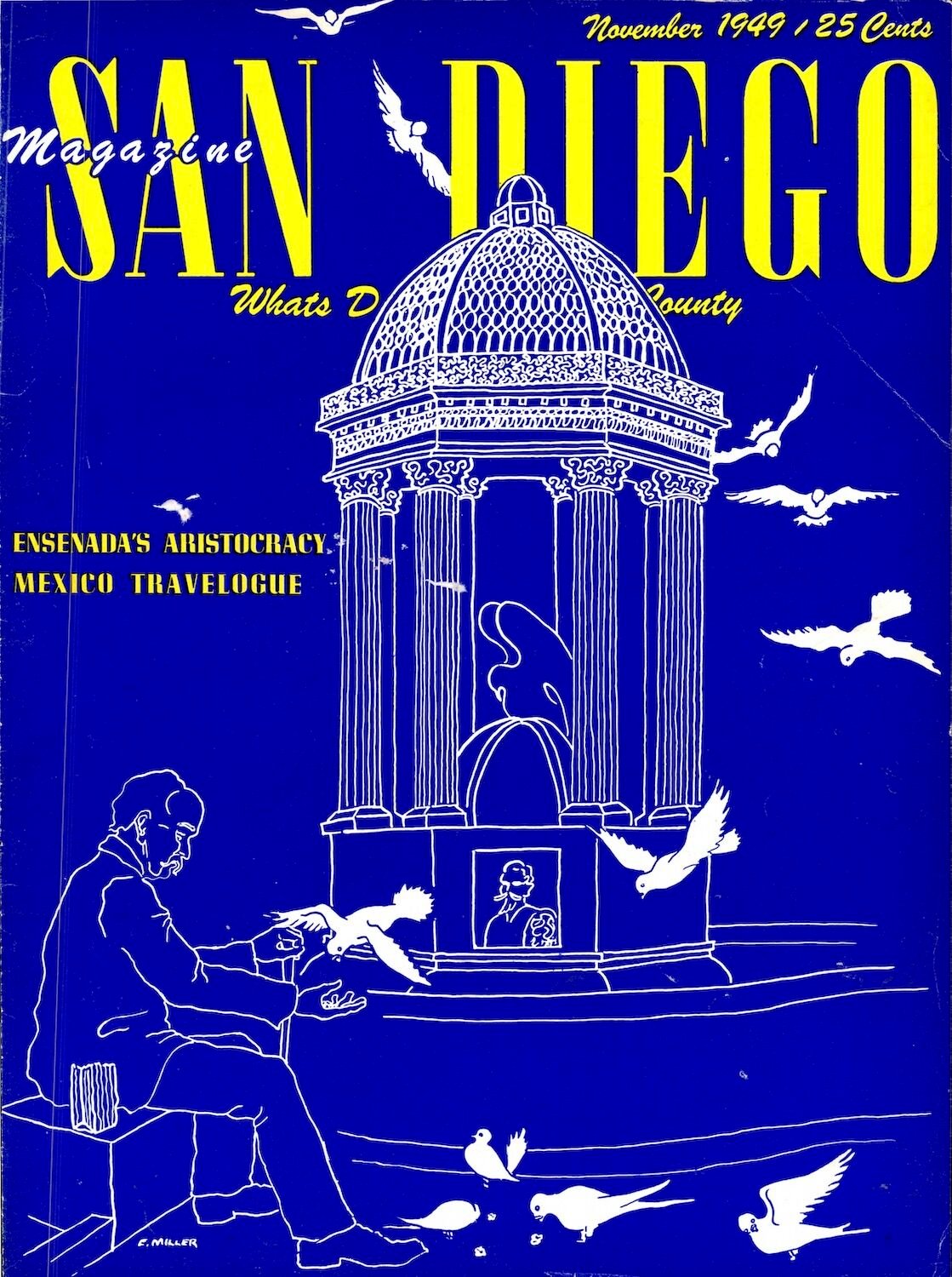
November 1949 San Diego Magazine Cover
Chosen By: Cole Novak, Web Content Editor
November 1949
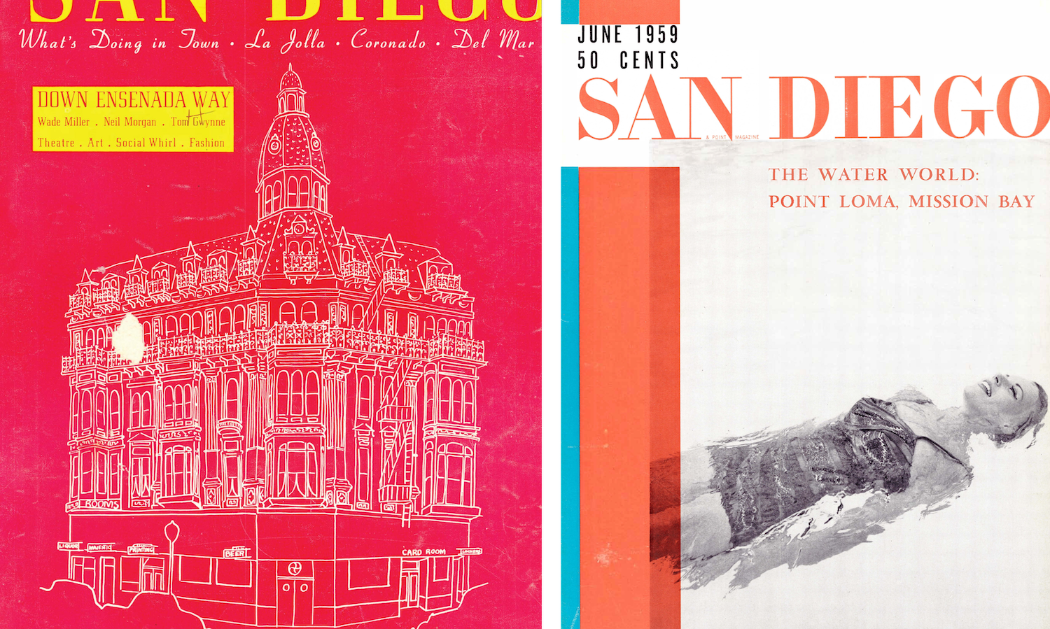
I have a soft spot in my heart for illustrated magazine covers. I love this style of line art—it reminds me of hand-made drawings by John Lennon and Kurt Vonnegut, among others. This cover by Enid Miller from the magazine’s second year features bold colors paired with serene illustrations. Makes me want to plan my next trip to Mexico.
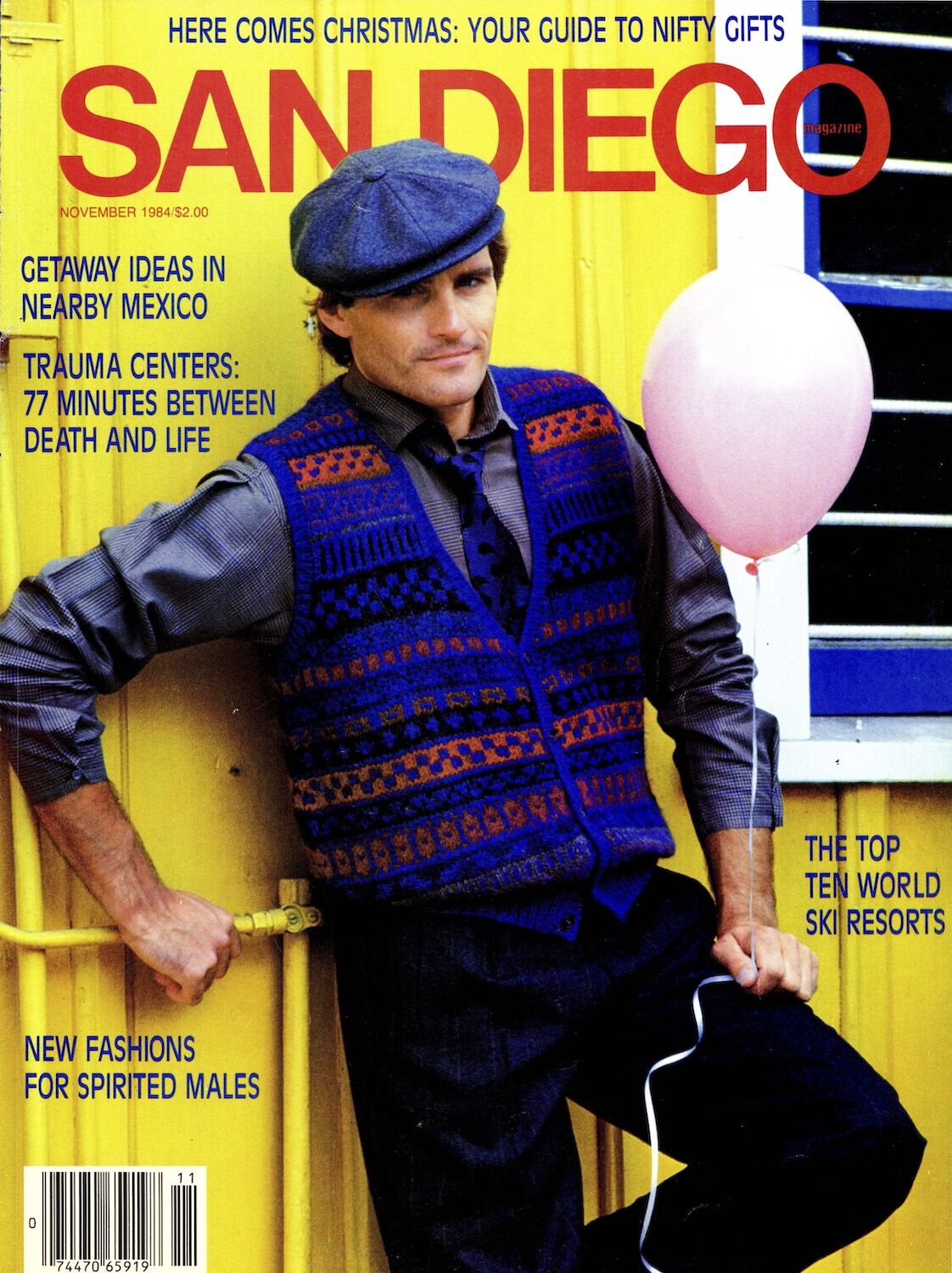
November 1984 San Diego Magazine Cover
Of all of the San Diego Magazine covers, this is certainly one of them. “New fashions for spirited males.” Huh? If the “spirited males” in question are fairground carnies, taxi drivers, or weird uncles, this cover nailed it.
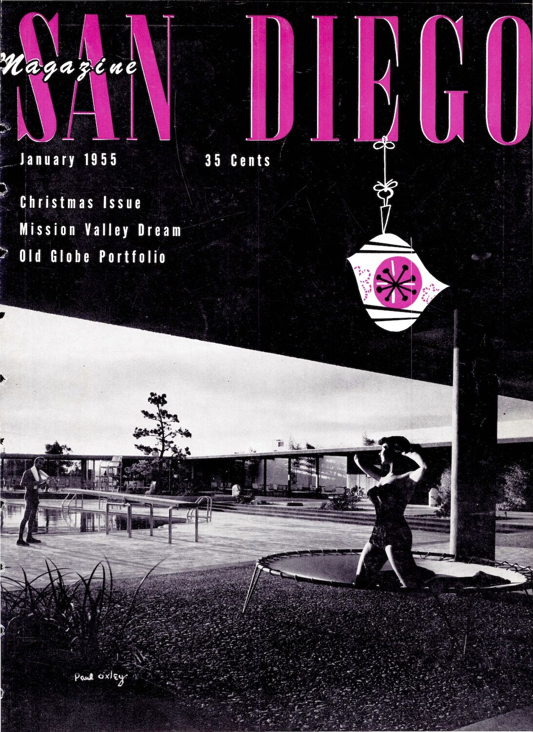
January 1955 San Diego Magazine Cover
Chosen By: Nicolle Monico, Digital Editor
January 1955
I love this cover because it is so random and makes me laugh to wonder what was going through the art director’s mind as they were concepting it. A Christmas issue. In a summery-looking backyard. A woman in a bathing suit posing… on a trampoline. Happy holidays! Don’t miss the illustrated ornament, lest you forget what we’re celebrating.
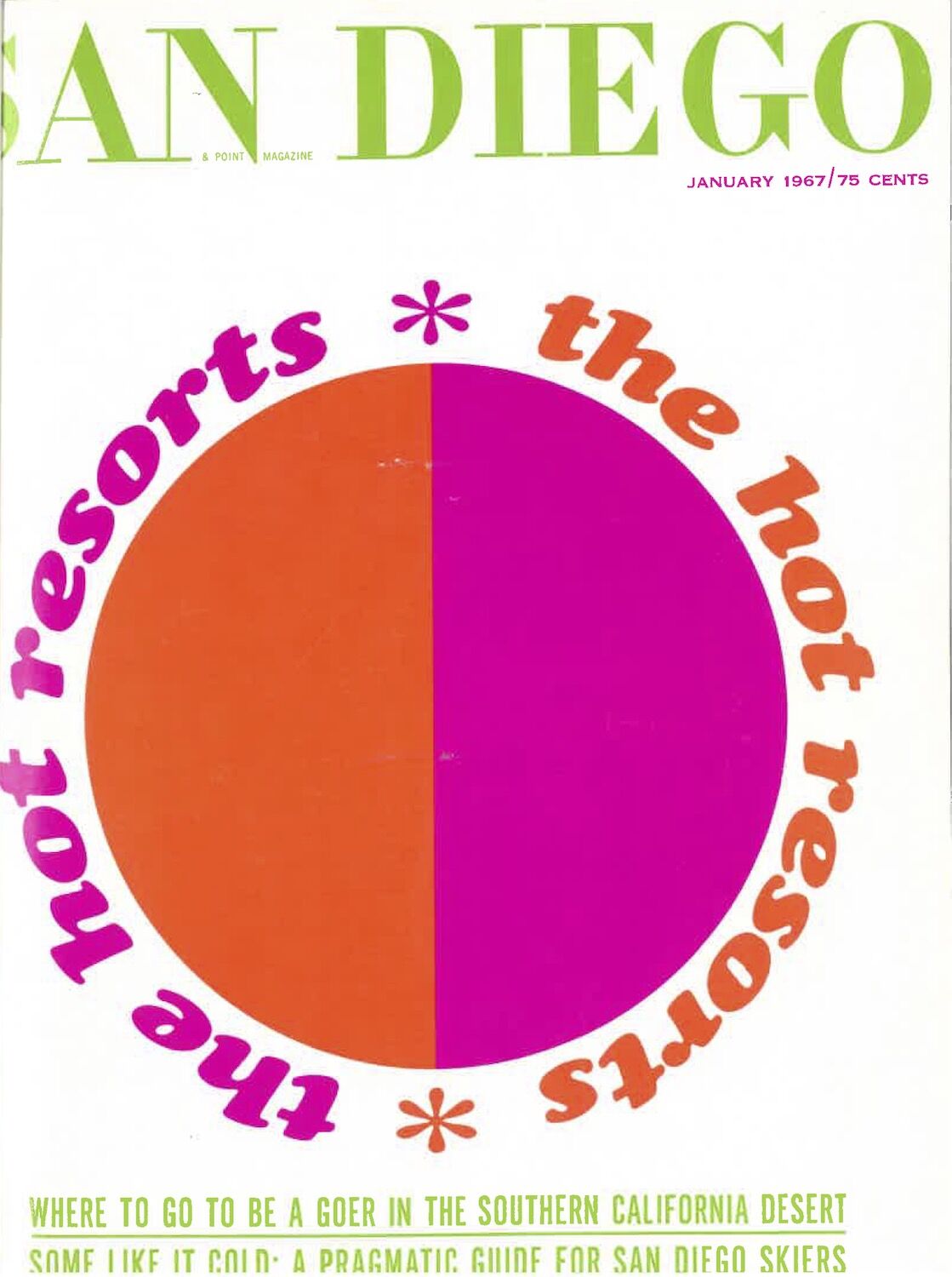
January 1967 San Diego Magazine Cover
January 1967
I don’t think I really need to say anything, but here we go. It’s a large two-toned circle smack dead in the center of the mag. And one of the coverlines teases pragmatism. How sexy. You know someone checked out during the holidays and decided to draft this up from some lounge chair in Cabo in between piña coladas.
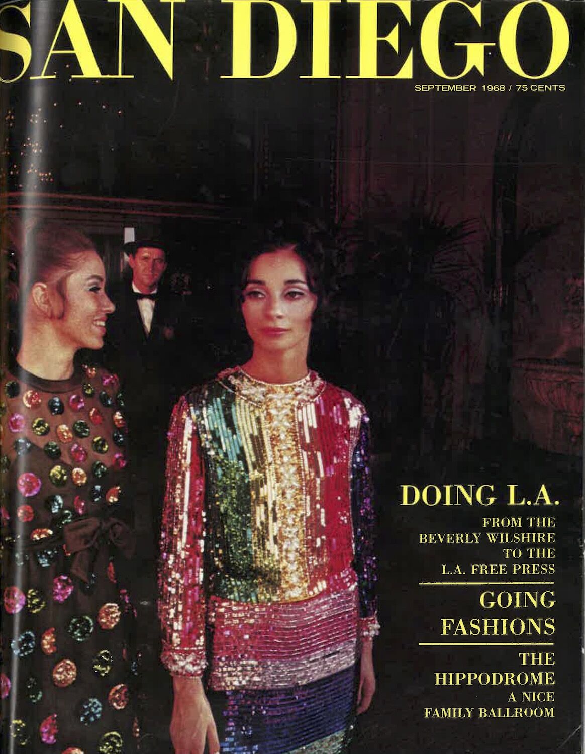
September 1968 San Diego Magazine Cover
Chosen By: Jennifer Ianni, Acting Managing Editor
September 1968
This cover epitomizes ’60s glam, which made it stand out to me. I was drawn to the women’s sparkly gowns, their hairstyles, and even the expressions on their faces as they exited the Beverly Wilshire Hotel. But what delighted me even more is that, when I read about the cover in the San Diego Magazine archives, I discovered that the red-headed model’s name is Ceviche, which is a name I’ve never heard given to a person. The ’60s really were a different time.
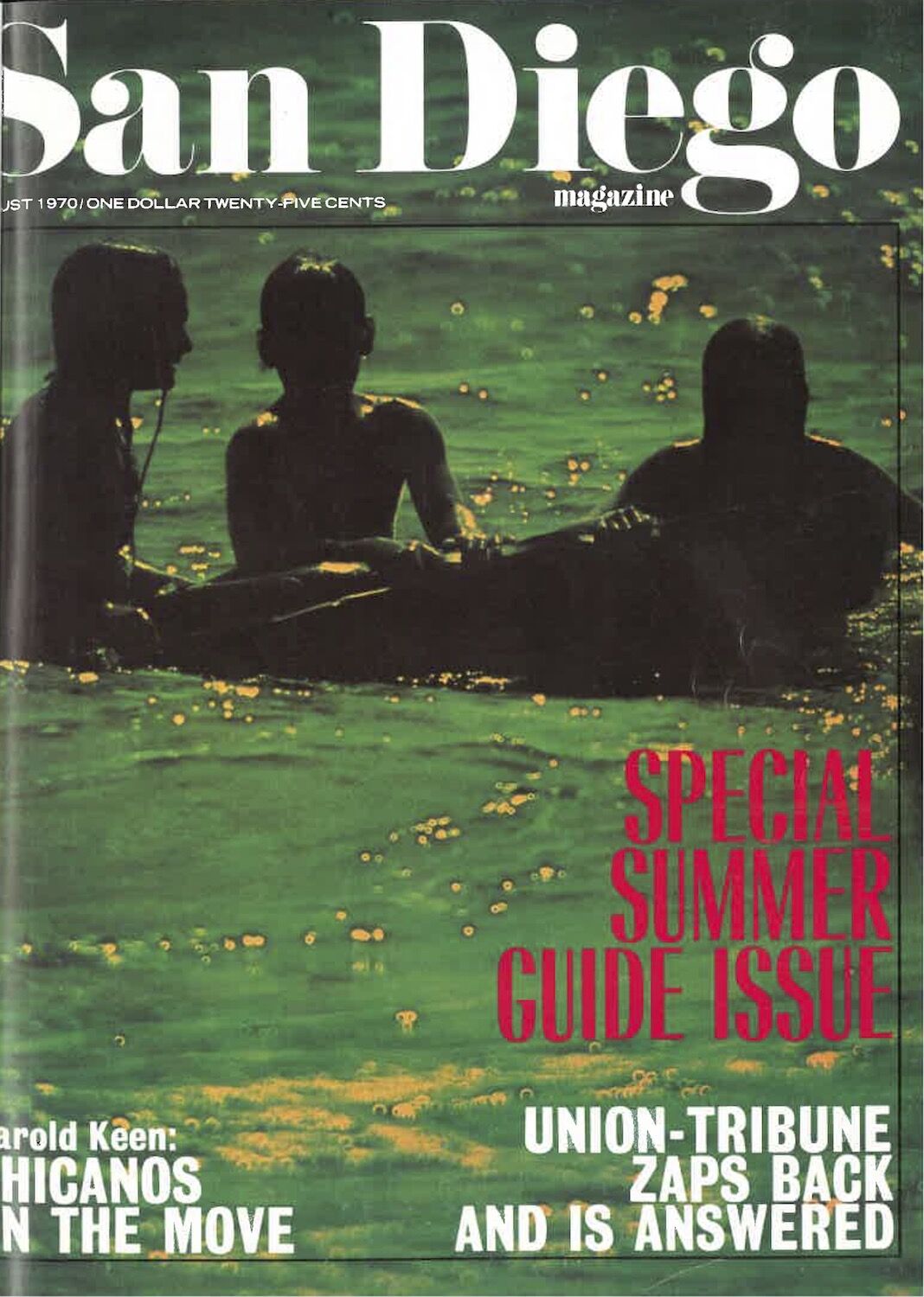
August 1970 San Diego Magazine Cover
August 1970
Three shadowy figures surrounded by water… Seems more like the stuff of horror movies than a regional lifestyle magazine cover. The photo is dark and it’s unclear what is happening, which is the antithesis of what a cover should be. The cover lines claim it’s a “Special Summer Guide,” but I’m genuinely concerned for these kids and hope they made it out of that water safely.
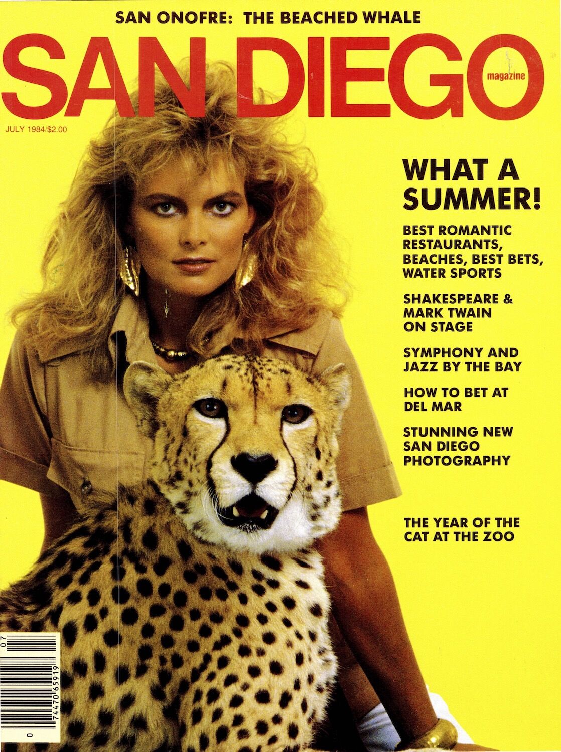
July 1984 San Diego Magazine Cover
Chosen By: Troy Johnson, Content Chief
July 1984
Fairly certain this is a Whitesnake album cover or a lost member of Mötley Crüe. The stylist senses this is their MTV moment and makes this woman complicit in it. Her eyes pounce. Her hair is depleting ozones. She is the Aquanet queen. The cheetah’s dead stare suggests a plea for help. I feel both empowered and endangered.

February 2012 San Diego Magazine Cover
February 2012
My weird vendetta against this cover is pretty well-known around here. Growing up in San Diego, I saw us typecast as tanned and taco’d people whose intellectual hobbies include polishing our watercraft and staring at the sun. Us locals know a far more complex, gritty, modern, artful, creative, interesting culture. My rage against reducing San Diego to a one-dimensional water-sun-woohoo! society has eased, but drawing a heart emoji in a boat wake still feels like being stabbed in the eye with a “Live, Laugh, Love” poster.
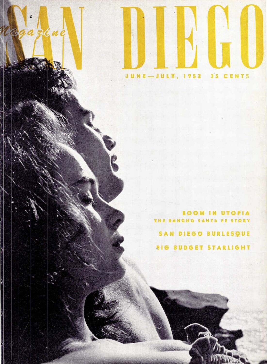
June-July 1952 San Diego Magazine Cover
Chosen By: Danielle Allaire, Staff Writer
June/July 1952
We were ahead of our time. We were auteurs before the auteurs. Is this not a missing still from a long-lost Godard film, with a little Fellini thrown in for good measure? It is. It’s called Le Soleil d’Amour and it was shot exclusively in San Diego. Okay, it’s not. But, in all its “nouvelle vague” glory, this cover uses effortless youth and nonchalant sex appeal to evoke a vignette of the potentially perfect summer day, to which we all aspire.
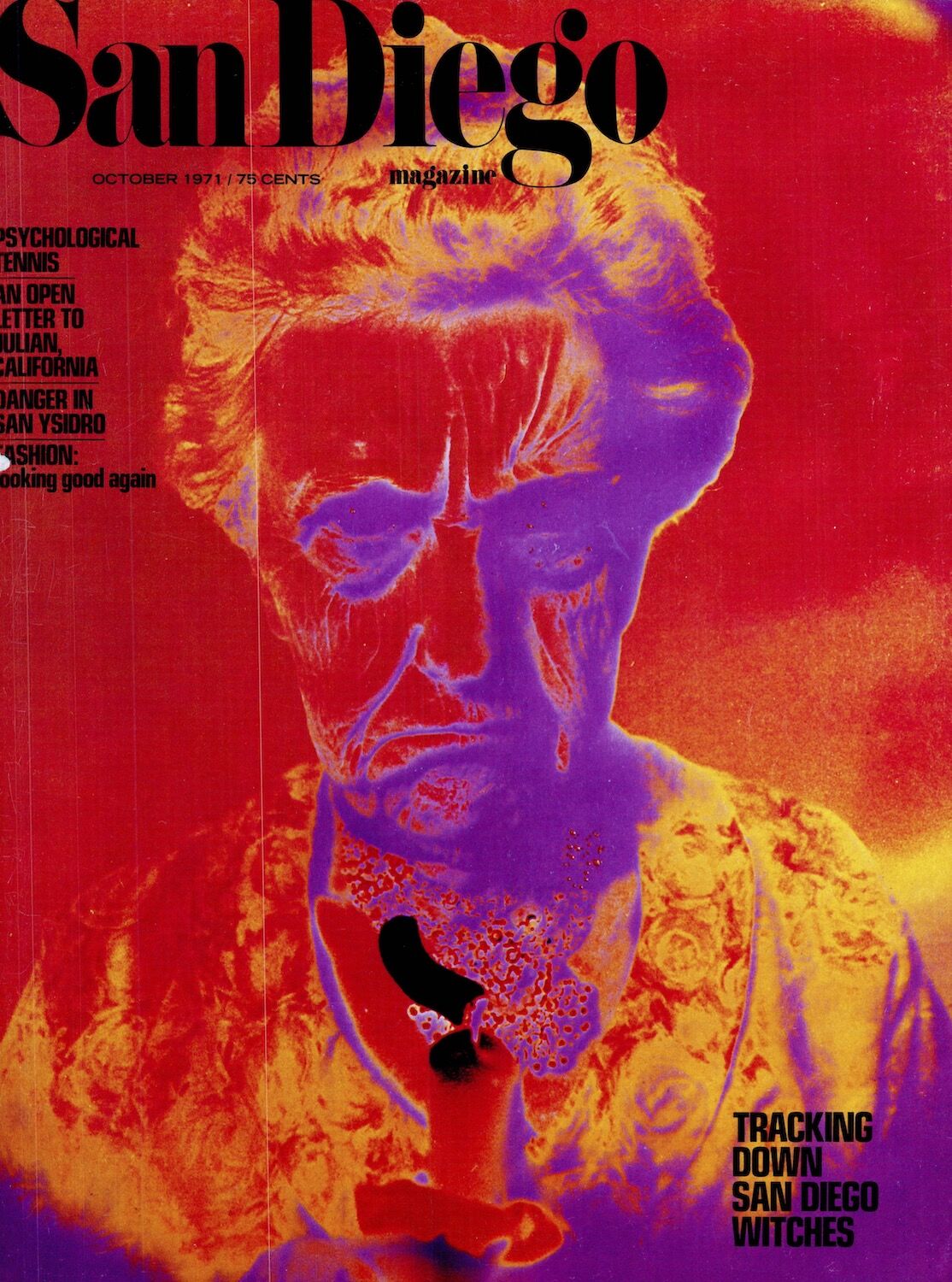
October 1971 San Diego Magazine Cover
October 1971
Ah, the age-old question: how to find witches? Apparently, if you shine a black light on them, they glow. The fact that we devoted not only an article, but an entire cover, to this witch-hunt (had to) makes me proud to be on the staff of a magazine that truly embraces diversity. But we all know that witches live in LA these days.

August 1973 San Diego Magazine Cover
Chosen By: Mateo Hoke, Executive Editor
August 1973
I’m on record saying I want this pipe-smoking fellow out of the archives and onto contemporary covers, like SDM’s very-own Eustace Tilley, looking different each time. The pipe could be a vape or a taco, the tennis racquet a vinyl record or a skateboard. The potential is endless. And how bad do we all want this Mona Lisa–smiling sun illustration festooned on a t-shirt?

June 2004 San Diego Magazine Cover
June 2004
Before social media, magazines basically sold themselves, so covers were just icing on an already desirable cake. Laziness reigned. But this one is a head-scratcher even when considering the era. I want to go back in time to the edit meeting where the ’04 team was hyped up throwing out ideas like, “I’ve got it! A guitar. ON A BEACH.” It does visually scream San Diego, though. I’ll give them that.
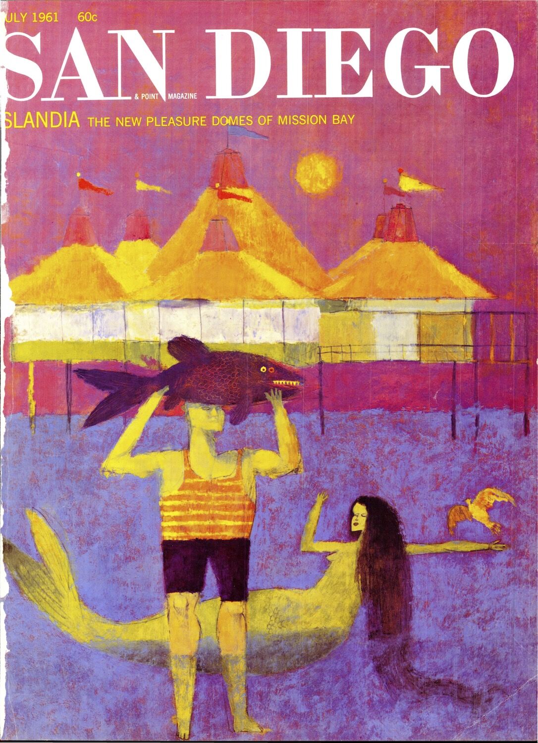
July 1961 San Diego Magazine Cover
Chosen By: Samantha Lacy, Art Director
July 1961
What a strange and mysterious scene we have here. I’m a sucker for full-bleed art on a cover and a huge fan of Phillip Kirkland’s work. Many of Kirkland’s illustrations for SDM were elegantly artful but edgy in their own way. There’s something oddly sinister about these beings—the lack of pupils, the fish teeth, the restless paint strokes. I’m falling for their siren song nonetheless.

May 1996 San Diego Magazine Cover
May 1996
Which is the bigger offender: Creepy, toothy, stalker-vibes Joseph Wambaugh imminently poised to flash you his latest hardcover from beneath his trench? Or the fact that this cover uses no less than six type colors in one paragraph?


