Rooms We Love / Dining Space
Brady Architectural Photography
Most of us haven’t left our homes for much more than groceries since last March, and the home humdrum has really started to kick in. One way to interrupt the boredom? Change up your environment—it can be as simple as rearranging the furniture. Or you might opt for a more impactful transformation and buy a new sofa, create an accent wall, or embark on a full makeover. Whatever your plans may be, we’ve compiled some inspiring San Diego rooms—from professional remodels to impressive DIYs—to give you some fresh ideas for creating a space you’ll love to live in.
Dreamy Dining
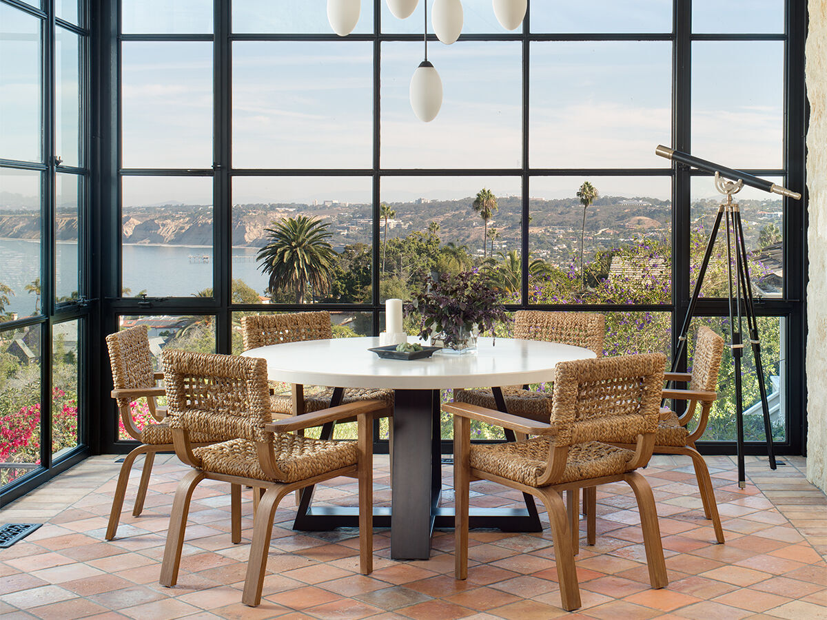
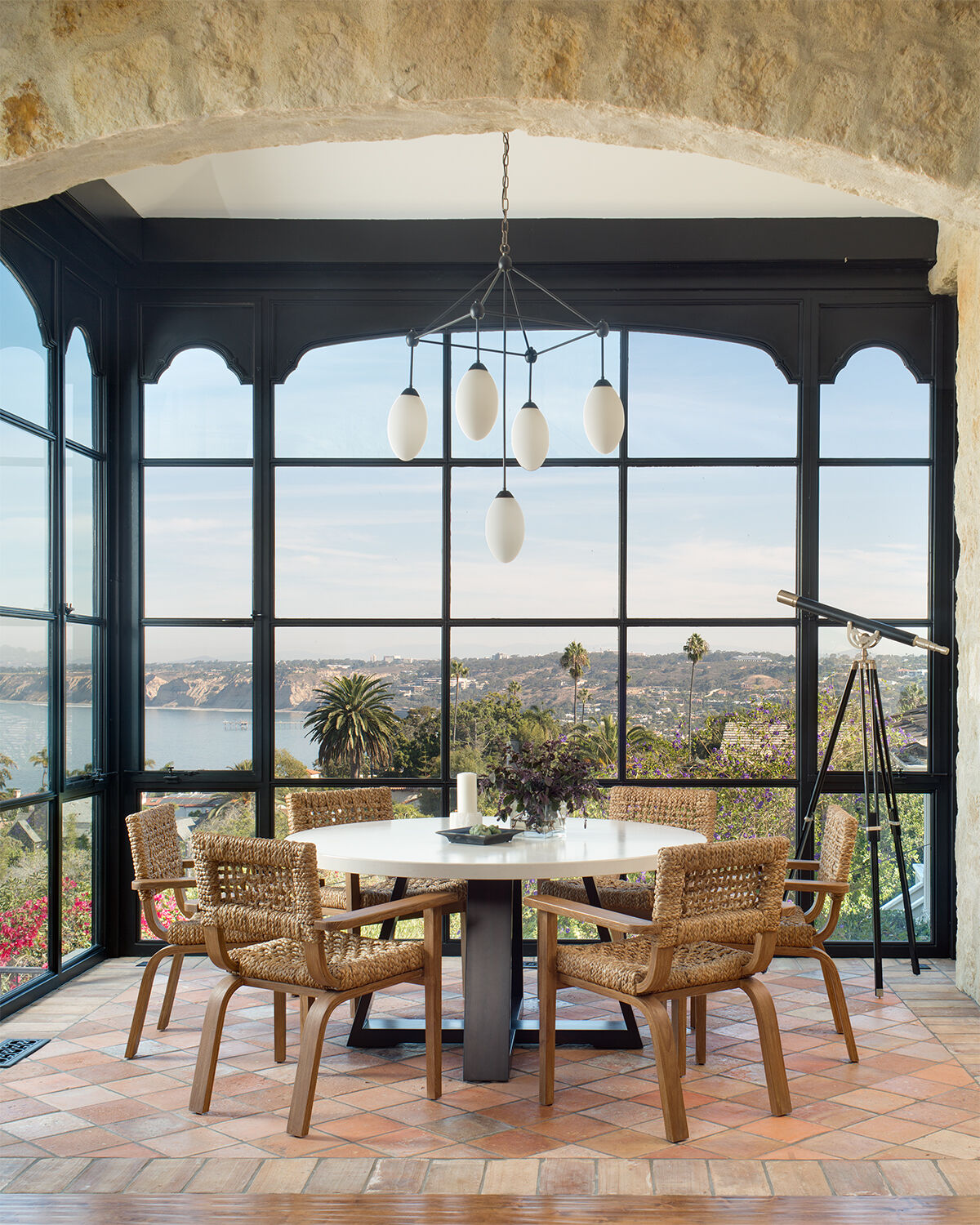
When Kristin Lomauro-Boom, of Kristin Lomauro Interior Design, first visited this La Jolla home, “it was over-the-top French country,” she says. “We took the country out, modernized it, and brought in a bit of Belgian cottage.”
Breakfast with a View
First thing to go? The giant ceiling light. Inspired by Lindsey Adelman’s collection of chandeliers, Lomauro-Boom designed this custom five-light fixture to hang without obscuring the view of La Jolla Shores. To surround the custom concrete-topped table she designed, she ordered woven Audoux-Minet armchairs. “I must have asked a dozen times, ‘Are they appropriate for dining?’” They weren’t. Though beautiful, the chairs were way too low. Luckily, she found these similar replacements from Ralph Lauren Home.
Rooms We Love / Entryway
Willow and Jade Interiors
Welcome Entry
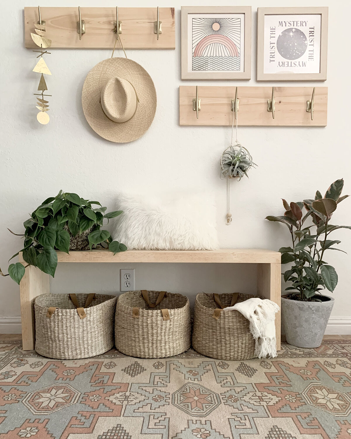
Lauren Andriany, the interior designer and stylist behind Willow and Jade Interiors, searched to find the perfect pieces that would set the relaxed vibe she hoped to evoke in her home. She took inspiration from her family’s love of Ojai and Joshua Tree in creating this modern entryway.
Space Savers
The foyer in Andriany’s Carlsbad home is small and had become a mess of accumulated shoes, backpacks, and purses. “I needed to create a functional, budget-friendly place for all the things,” she says. It began with the artwork. She spotted these Real Fun, Wow! prints from Ojai artist Daren Thomas Magee, which inspired her to create a gallery-like vignette on the wall.
She designed the hook rack, bench, pillow and shoe shelf console (on the opposite wall) and found the baskets to corral clutter at Target. To cozy up the entry, Andriany added a vintage rug, a hammered brass wall hanging from Vida + Luz, plants from Barrel & Branches, and hangers from Braid & Wood.
Rooms We Love / Bathroom Redo Sink
Samantha Goh
Bathroom Redo
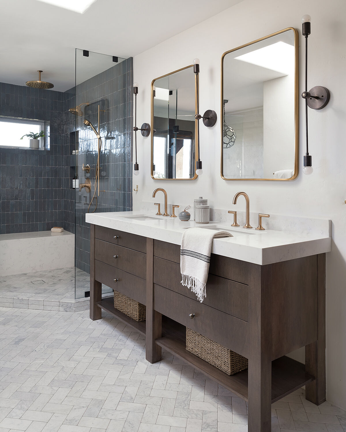
Chris and Erin Veit had been living in the guest house on Erin’s parents’ San Marcos property before they had their baby and swapped spaces with their folks. They always loved the character of the Spanish-style home, but when it came time to move into it, they knew they wanted to add a modern touch. Katie Gebhardt, principal designer and owner of Solstice Interiors, started the renovation with the bathroom. “The original bathroom had lots of walls that created a series of small spaces,” she says. “We removed them to make it one big room.”
Rooms We Love / Bathroom Redo Bath
Samantha Goh
Spa-Quality Relaxation
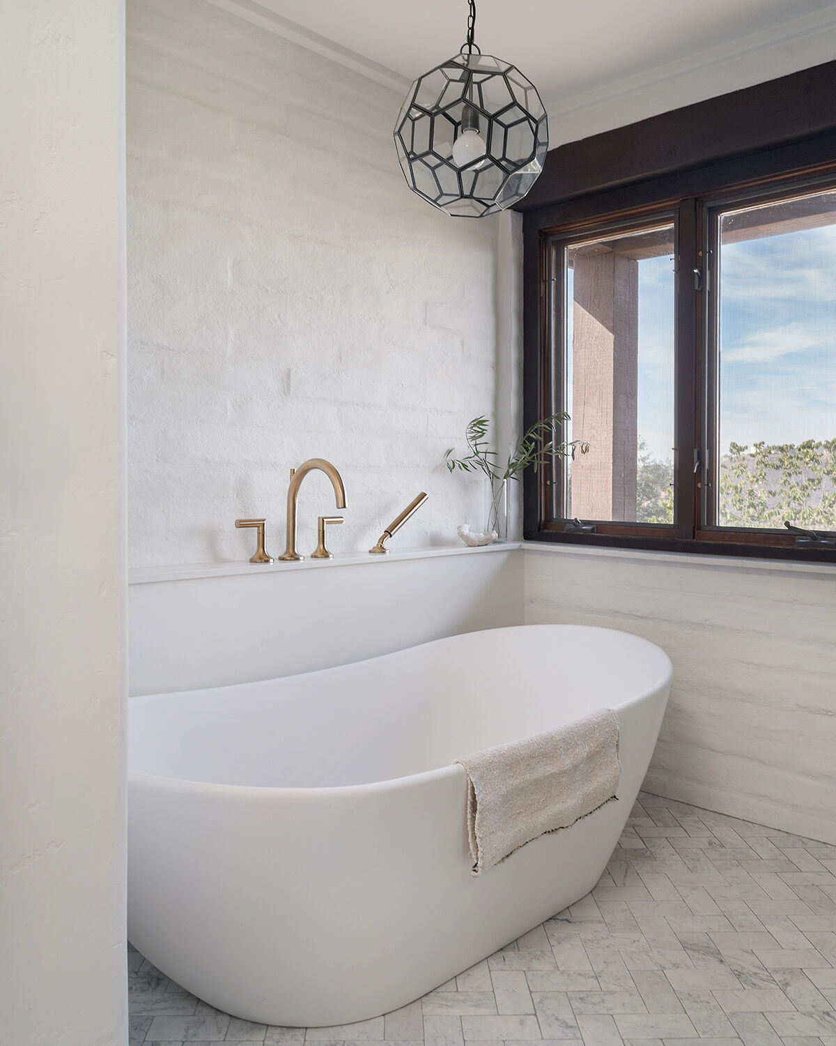
Under the window is a freestanding tub from Signature Hardware. The brick wall, which Gebhardt painted white, is original, but the ledge on it was a clever solution she designed to hide the Brizo Odin tub filler’s plumbing. The geometric bronze pendant above the tub provides a rich contrast against the brass hardware elsewhere.
In the shower, the Zellige subway tiles from Zia Tile bring a pop of color; and the bench, which matches the vanity’s Caesarstone countertops, invites lingering beneath three Brizo showerhead options.
Streamlined and Warm
Honed and tumbled marble from North County Tile & Stone replaced terracotta tiles on the floor, but Gebhardt didn’t want to eliminate the Spanish feel altogether. She introduced a rich maple stain on the custom built-in vanities to coordinate with wood tones throughout the home. Antique brass West Elm mirrors paired with oxidized brass wall sconces from Worley’s Lighting add just a touch of glam to make this a serene escape for self-care.
Rooms We Love / Living Room Sofa
Sarah Caligiuri
In Living (Room) Color
Living in a rental property doesn’t mean your space has to feel impersonal. Just ask Sarah Caligiuri—or her 70,000 Instagram followers. She’s put her color-loving bohemian spin on every place she’s lived, including the apartment she currently leases in Carlsbad. “I paint, lay down rugs, and switch out the lighting fixtures to change things up,” she says.
Rooms We Love / Living Room Display
Sarah Caligiuri
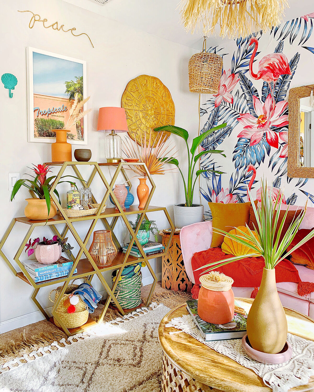
Tropical Lounge
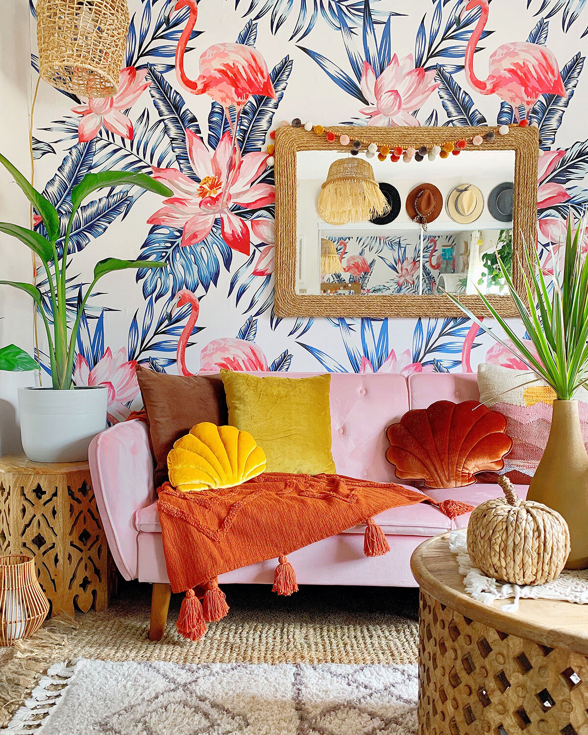
Caligiuri installed peel-and-stick paper in a fun flamingo print from Coloray Wallpaper Shop, and it wasn’t her first time using sticker-like wallpaper. She’s done much smaller spaces before, but hanging paper on a textured wall came with its own set of challenges. If your walls are textured, pick an allover pattern and be patient. “It takes a couple of tries, but it’s definitely doable,” she says.
Flexible Furnishings
This home office also serves as a guest room, so Caligiuri picked a pink velvet futon from Novogratz and keeps a closet full of throw pillows to cozy it up. Her collection of decorative cushions includes a mix of bold solids, like the marigold shell from MoiMili, and prints that read like neutrals. “Moving pillows and rugs around frequently prevents me from getting bored with a look,” she says. The geometric shelving from Drew Barrymore’s line for Walmart lets Caligiuri display knickknacks and keeps necessities—camera, workout bands, extra blankets—out of sight in decorative baskets.
Rooms We Love / Kids’ Space Giraffe
Lindsey Vorwith
Kids’ Space
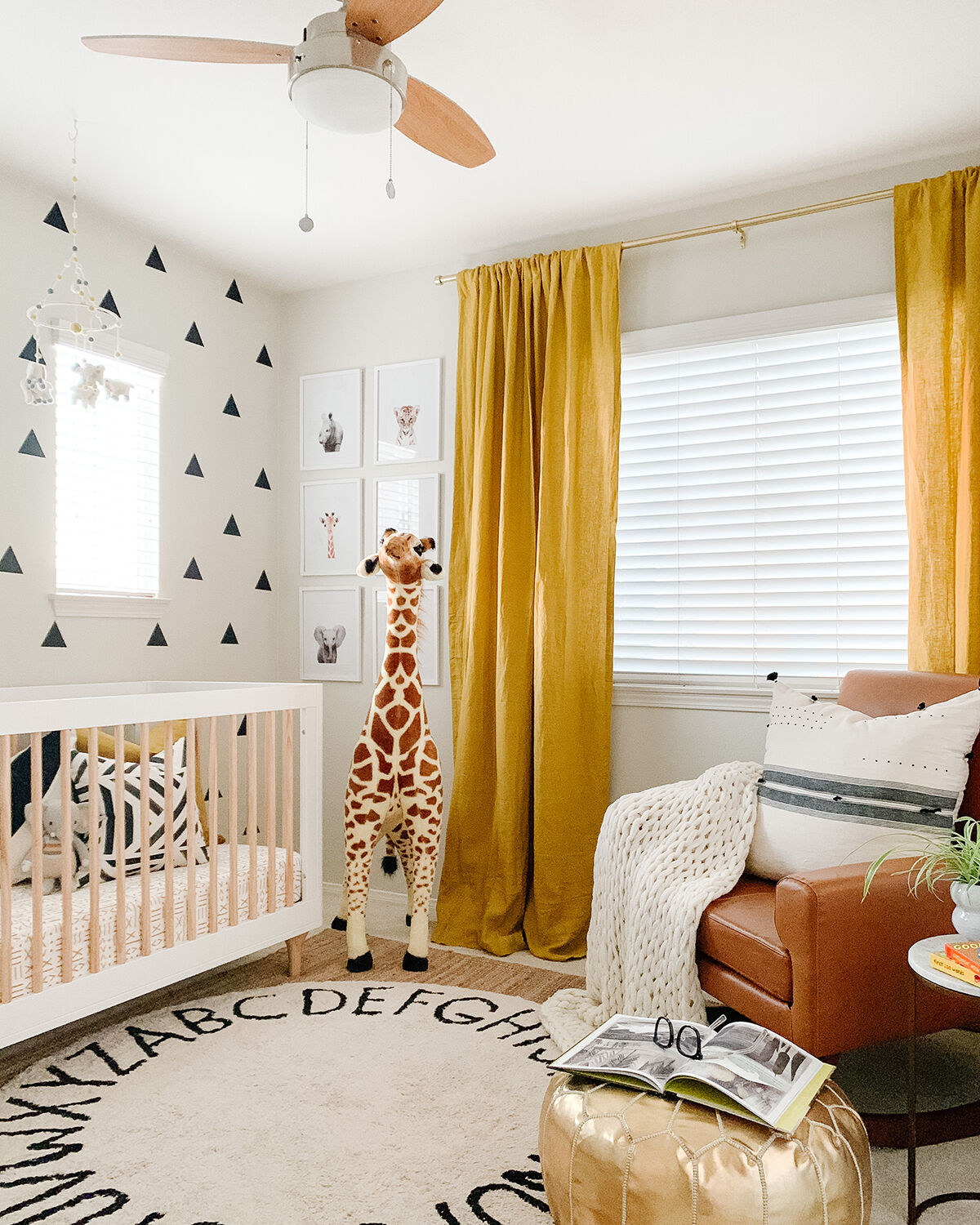
After Realtor Lindsey Vorwith—who also dabbles in design—sold a home in San Elijo Hills, her clients asked if she would create the nursery for their expected baby boy. The overall plan: modern, neutral, on a $2,000 budget.
Rooms We Love / Kids’ Space
Lindsey Vorwith
Pop Goes the Color
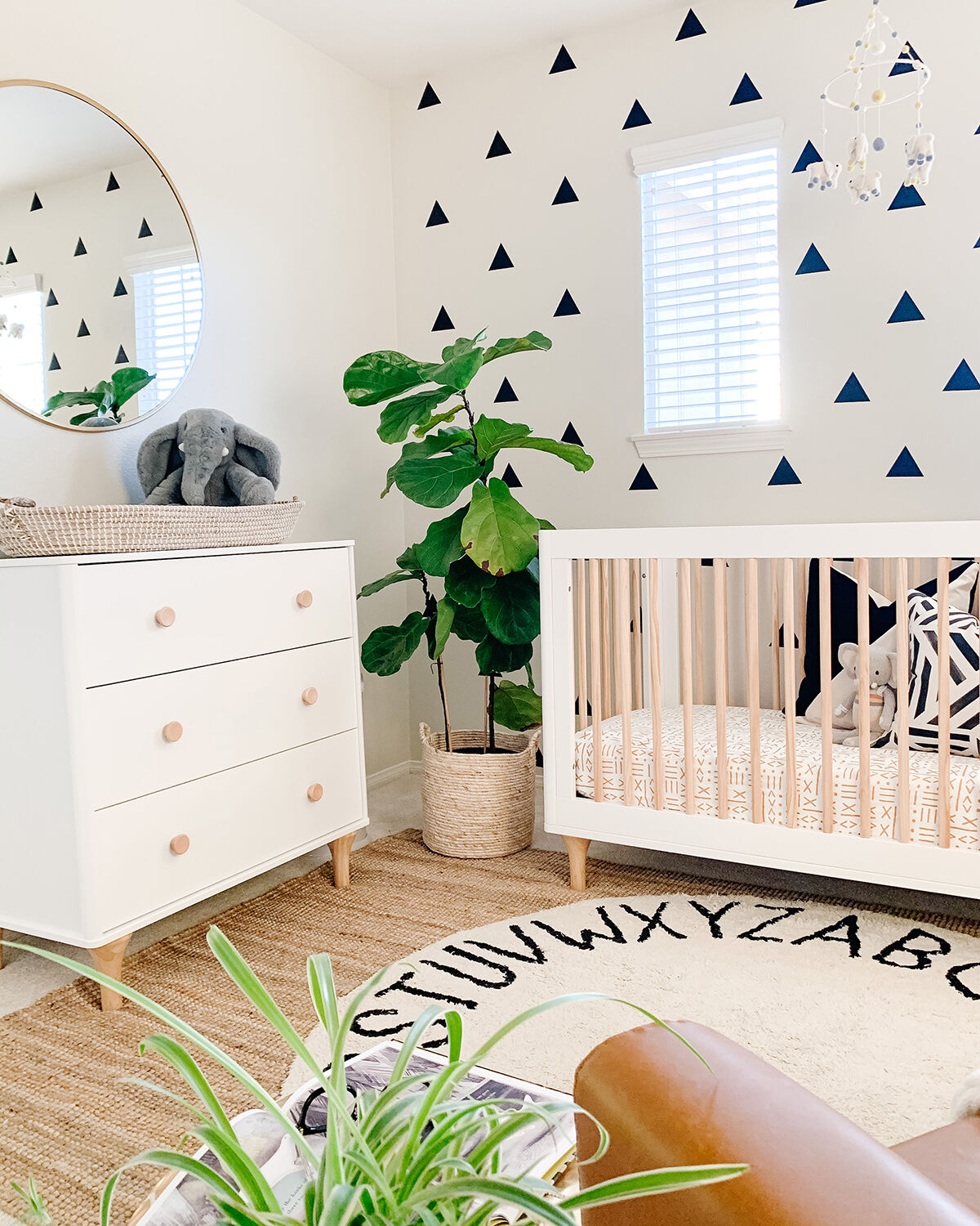
The couple wanted to keep the gray walls, so Vorwith found peel-and-stick triangular decals from Urban Wall for an accent wall behind the crib. In another corner hangs a collection of baby-animal prints that served as initial inspiration for the design direction. Vorwith introduced Belgian linen curtains from West Elm, a crib sheet from Carousel Designs, and a throw pillow from Living Spaces (the other pillows are Willa Skye Home) in a bold mustard yellow.
Easy as ABC
By layering rugs over the existing wall-to-wall carpeting, Vorwith added personality underfoot. She unrolled a giant Ikea jute rug and topped it with a Lorena Canals rug from Nordstrom.
Rooms We Love / Bedroom
Jennie Sullins
Cozy Bedroom
Maker and designer Jennie Sullins had redone the main space in her 1,000-square-foot Serra Mesa home a couple of times in her eight years of home ownership, but she’d always neglected her bedroom. When quarantine had her at home full time, she entered the online One Room Challenge and gave herself seven weeks to transform it.
Rooms We Love / Bedroom Fan
Jennie Sullins
Making a Statement
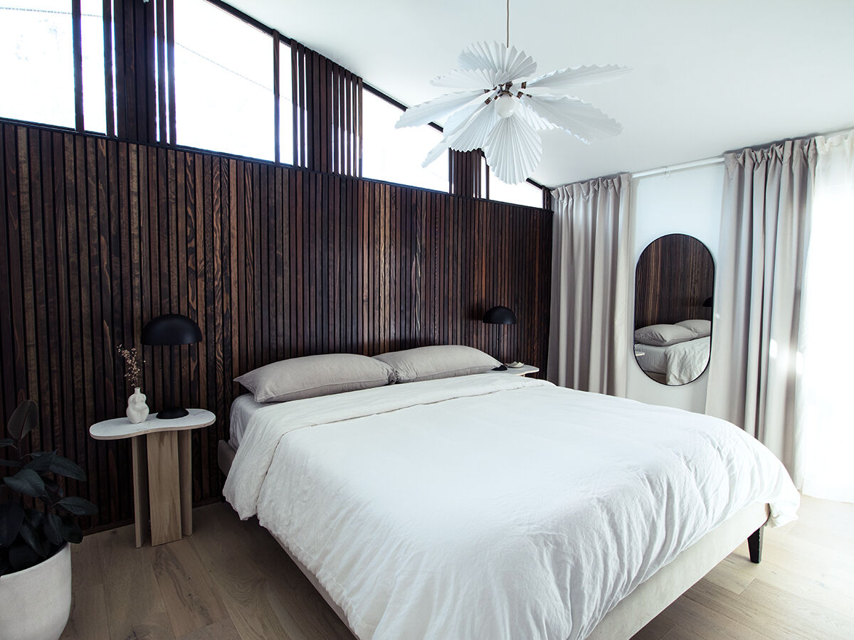
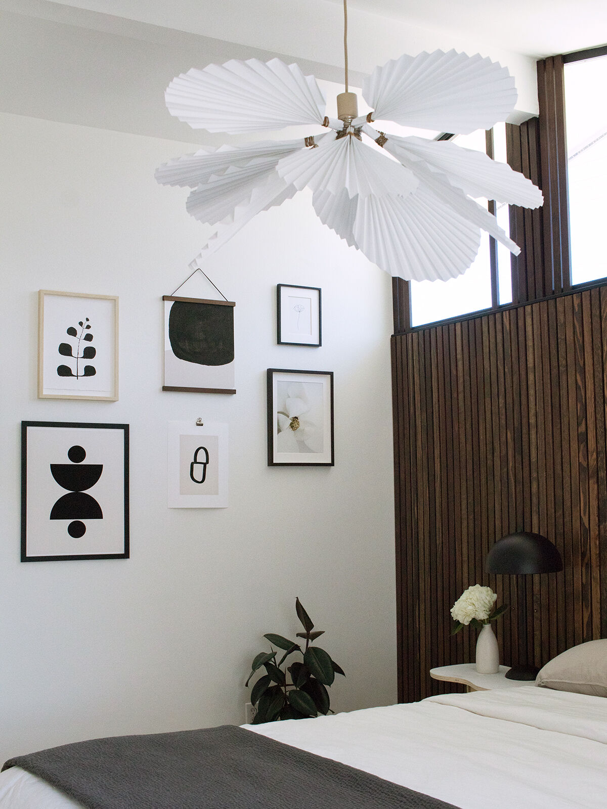
“I decided to highlight the architecture and height of the room by creating a wood-slat wall and taking some of the slats up to the ceiling,” Sullins says. Aiming for a contemporary Scandinavian feel, she experimented with various woods and settled on redwood. She painted the wall with one coat of Ace Hardware’s exclusive OPI + Clark + Kensington flat paint in Black Onyx. Then she spent weeks sanding, staining, and sealing all the boards with matte polyurethane before cutting and installing each one individually. Initial sketches included swivel-arm sconces above the bed, but “after all that work, I didn’t have the heart to screw into that wall,” she says. The dome-shaped table lamp swaps sit atop nightstands that she cut to mimic the curves on her sons’ race car track.
Let There Be Light
Sullins envisioned an oversized chandelier, like Isamu Noguchi’s Akari light sculpture, to replace the ceiling fan above the bed, but spending thousands on a fixture wasn’t in the budget. Instead, she adapted a design from a blog post to create this large floral light. Using Ferm Living’s cashmere-colored socket pendant as a base, she folded heavy art paper into fans and attached them to the pendant with jewelry wire.


