San Diego is sunny, laid-back, coastal, hikey, bikey, and beery. And while our magazine’s company culture definitely embodied our city’s ethos, our offices most definitely did not.
It was high time for a change. We enlisted Allison Whitt of DesignX Architecture and Interiors to give the magazine’s downtown headquarters the face-lift it needed.
“When I first walked into their office, I was surprised to find such a creative group of people working in a space that seemed better suited for a law firm from the ’80s,” Whitt recalls. “We all agreed they needed a space that would reflect their energy and creativity.”
The beige-green walls and carpets were the first to go. The walls were repainted in an ocean palette of greens and blues. Every employee got to pick a statement-wall color for their office from a list of shades selected by Whitt. The decades-old carpet was replaced with a clean, gray-hued luxury vinyl tile.
But that was just the start. The conference room, kitchen, and common and reception areas also got a complete overhaul.
San Diego Magazine’s Downtown Offices Get a Stylish Overhaul
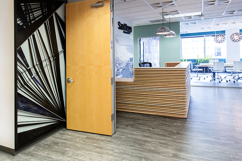
Custom metal screens by Ntrope Design at the main entryway were designed to reflect the energy and spirit of San Diego Magazine. The reception area refresh included a new desk with shifting wood pieces by SD Cabinets & Upholstery and an all-glass wall that offers visitors a view of the conference room and downtown skyline.
To open up and brighten the reception area, Whitt switched out the conference room’s dated textured glass wall, which is in direct line of sight upon entering the office. Now the all-clear wall offers visitors a sweeping view of downtown. She also added a funky reception desk composed of shifting wood pieces. Behind the desk is a floor-to-ceiling vintage photo of Highway 101 between Del Mar and Torrey Pines. The image is a personal favorite handpicked by Editor-in-Chief Erin Meanley Glenny, who’d also selected it for the cover of a special anniversary issue in 2015.
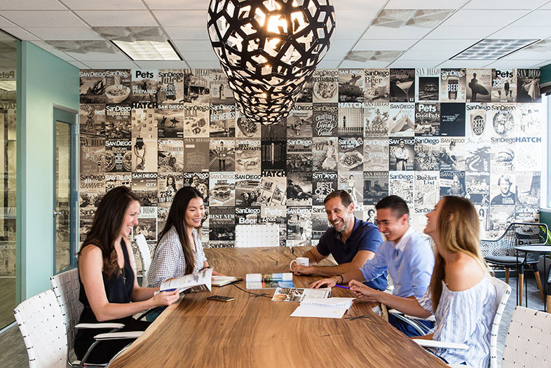
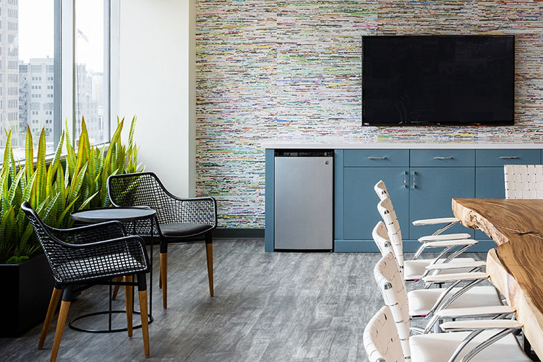
Merging style and function, the new conference room boasts unique design details like recycled-magazine wallpaper, geometric lighting pendants, and a sepia-toned collage mural of old magazine covers. Whitt ensured that the new conference table, made from a live-edge slab of acacia wood, would seat as many people as the previous one had, if not more.
San Diego Magazine’s Downtown Offices Get a Stylish Overhaul
The conference room features a recycled-magazine wallpaper by Mark Lyons & Co.
Design Tips
by Allison Whitt
â
How to help your office reflect your brand
Your office has the opportunity to tell a unique story about your company and directly impact someone’s reaction to your brand. Start by asking some fundamental questions: What do we value and what makes us different? It also helps to know what kind of tone you want to set—it could be conservative and formal, or edgy and casual, or somewhere in between.
Four ways to make your office or desk area your own
1. Choose your own task lighting. It gives you control over the ambient feel of your space.
2. Add color in the form of an accent wall and/or artwork, if the space allows.
3. Incorporate indoor-friendly, low-maintenance plants, such as succulents. Even realistic artificial plants can add life and brighten up an otherwise dull cube or office.
4. Experiment with seating and desk alternatives, like exercise balls and standing desks.More and more companies are accepting these modifications as normal requests from their employees.
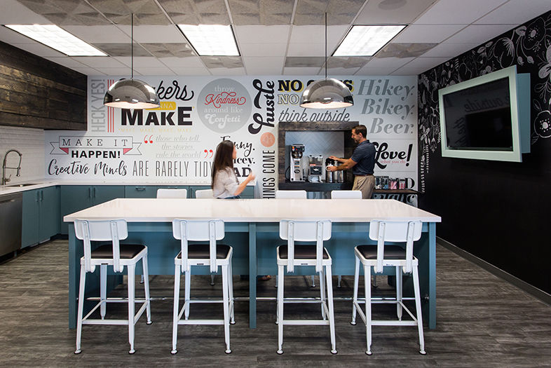
The other major change was the kitchen. Whitt worked with Jaime Partners to turn the once tiny and closed-off kitchen into an open, collaborative workspace, knocking down several walls and taking over an adjacent office. A mix of quartz, metal, beveled subway tile, and rustic wood, the kitchen has all the essential appliances, plus a large island with bar seating on both sides. The island serves as a second meeting area and “encourages a more interactive work environment,” Whitt explains.
The kitchen also boasts a custom mural, conceived by Whitt, that displays different mantras, slogans, and sayings often used by the magazine’s editorial and marketing departments.
San Diego Magazine’s Downtown Offices Get a Stylish Overhaul
The new kitchen features an open layout with a large island that serves as an extra meeting space, and another custom mural printed by Scantech Graphics displays sayings and slogans used by magazine staff.
The main hallway—formerly a sea of bulky desks, copiers, and abandoned office furniture—now has clusters of side chairs and sofas and rows of sleek white desks, which also facilitate impromptu meetings and creative discussions.
“The feeling of chaos in the common areas was amended by creating an organized equipment closet,” Whitt says. “And the wasted space was made functional by using desks appropriate for an open office.”
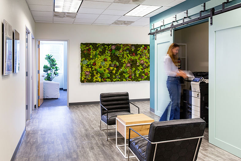
San Diego Magazine’s Downtown Offices Get a Stylish Overhaul
The main hallway is decked with a living plant wall by Hot House Flowers. Whitt helped organize the common area by creating an equipment closet for printers and copiers with sliding barn doors and adding sleek seating areas with furniture by Industry West.
Other previously stark corridors now showcase a living plant wall and dozens of oversized classic magazine covers, chosen by the staff and printed on acrylic. The elevator lobby holds another collage mural of vibrant images from the magazine that best represent the brand and our city.
“It was important to me that the staff be directly involved in the design process, since they ARE San Diego Magazine,” Whitt says. “Every element ties into what I feel represents a hip and savvy magazine all about San Diego.”
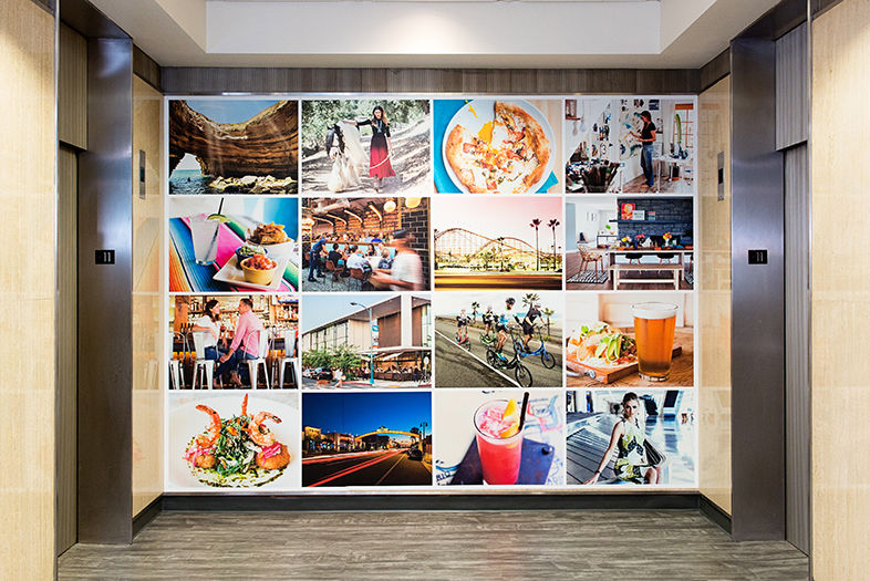
San Diego Magazine’s Downtown Offices Get a Stylish Overhaul
Another Scantech Graphics mural in the elevator lobby comprises a collage of favorite magazine images, selected by staff.
Vendor Shout-Out!
Designer
Allison Whitt, DesignX Architecture & Interiors
424-477-9341
Contractor
619-269-1320
Wall Graphics
858-495-0727
Wallpaper
619-985-5345
Signage
858-391-8084
Reception Wall Cladding
858-922-4338
Countertops
619-202-0017
Furniture
843-812-9650
Plants and Plant Wall
Hot House Flowers
858-373-7279
Conference Room Table
858-481-8044
Ceiling Tiles
215-925-9359 x112
Conference Room Shades
619-461-2101
Acrylic Artwork
619-281-3486
Reception Desk
SD Cabinets & Upholstery

San Diego Magazine’s Downtown Offices Get a Stylish Overhaul
Our new conference room features a custom sepia-toned wall collage of past magazine covers, printed by Scantech Graphics. A live-edge acacia table by David Alan Collection, surrounded by Zuo Modern chairs, anchors the space.

