stone wall covered in ivy
Earth Tones
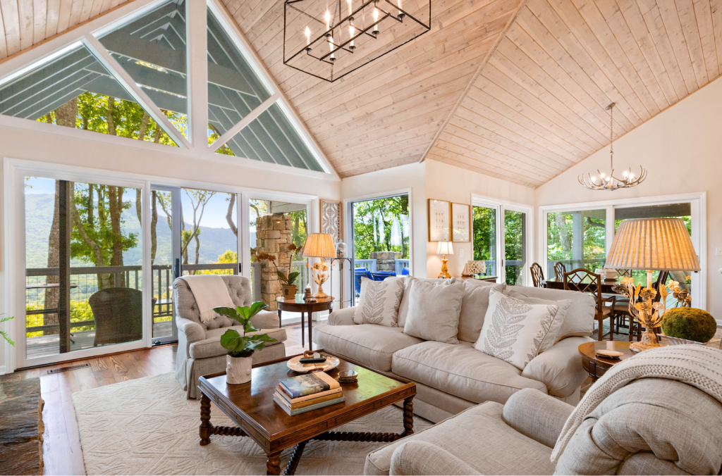
The living room is the first space you see upon entering the McQueen house in Point Loma. Elegant and inviting, it’s a study in transitional style, the blending of modern and traditional décor. “We built the room around these chairs that we loved,” homeowner Natalie McQueen says of her two camel-colored wingback chairs, which are family heirlooms. “I liked the traditional aspects but wanted to add modern elements.” She enlisted Timothy Ruiz and Lauren Manas of Pacific Interiors. They stuck with earth tones to complement the chairs, added marble to the fireplace, and, because the room gets so much light, chose a richer color for the walls, Valley Forge Tan by Benjamin Moore. The J. Redmond sofa and armchairs with Kravet fabric were custom-made to fit the space. Tall plants accentuate the room’s dramatic ceilings. Other modern accents include a coffee table from Williams-Sonoma Home and area rug by Calvin Klein.
Historical Roots
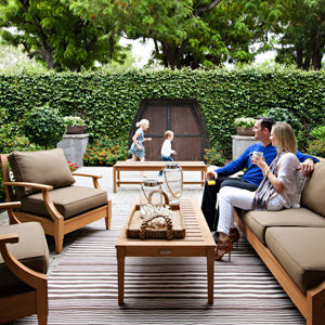
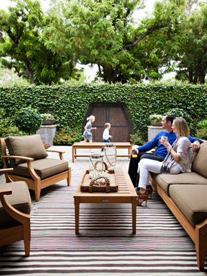
At the perimeter of this outdoor entertaining space lies a storybook stone wall. Covered with fig ivy, the wall was once part of the historic Rosecroft mansion’s begonia gardens. In the 1960s the gardens were closed and replaced by houses, but the wall remains as a historical landmark. Above: Homeowners Tim and Natalie McQueen watch daughter Bridget (8) and son Mitch (4) play. (Furniture by Restoration Hardware, accessories by Pottery Barn, area rug from Scout at Quarters D in Liberty Station)
Flipping Out
Its owners sought to preserve the original character of the house, which was built in 1989. “I wanted the outside to look as traditional as possible,” Natalie McQueen says. Her design team repainted the exterior and added flower boxes and Belgard pavers to the front yard. And yes, that’s eight-year-old Bridget doing a perfect back handspring on the grass. Stick it! (Landscaping by Pedro Ortega; floral arrangements by Erik Schumann)
Heart of the Home
The McQueens worked with contractor Robert McCarron to completely gut the original kitchen. They kept most of the existing layout, while extending the island and building an overhang with opposing pot racks. Stainless steel appliances give the space an industrial feel. Lava stone countertops and beveled subway tile create a crisp black-and-white aesthetic. For extra warmth and interest, designer Timothy Ruiz suggested adding a section of walnut cabinetry. Although the darker wood is built in, it’s meant to look like a hutch, or stand-alone piece of furniture. “I think it’s one of the best kitchens I’ve ever done,” Ruiz says of the space’s function and style. In the foreground, a whimsical chalkboard wall serves as a place to write messages and notes.
Clean and Simple
In keeping with the transitional style, designer Timothy Ruiz mixed ultra-modern chrome and white leather dining chairs by Bontempi with a classic dining table (another inherited antique). “When you pare everything down, and keep it real clean and simple, that’s how you keep your traditional pieces looking more modern,” Ruiz says. (Photographic painting by local artist Monica Hoover, purchased at Mixture in Little Italy; large seashell centerpiece from Z Gallerie)
Boyish Charm
When four-year-old Mitch outgrew his nursery, his mom and her designers turned his bedroom into a nautical-themed play zone. One essential? Custom built-ins to maximize toy storage. They chose moss-green paint because it was “a little different than the traditional boy colors.” Starfish pulls from San Diego Hardware add a fun seaside touch. The shelves are lined with beloved bedtime books and gifts from friends, like the spotted ukulele. Another gift—an old fishing rod—stands in the corner. “He loves to fish and loves boats,” mom Natalie explains. (Bedding from Serena & Lily, bed and dresser by Stanley Furniture Co.’s Young America)
European Influence
PARTNER CONTENT
The lone bit of pattern, courtesy of paisley wallpaper and a European area rug, is in the master bedroom sitting area. Here, traditional elements like wicker chairs blend with modern throw pillows from Mixture and an abstract painting. The antique European chest is another family heirloom. “We lived in London when we were young, and my parents brought a lot of stuff back,” Natalie says. “They’ve slowly passed it down to me.” (Chair cushions covered in Robert Allen fabric, wallpaper from Sterling Interiors/Design)
