The Glass House on Point Loma
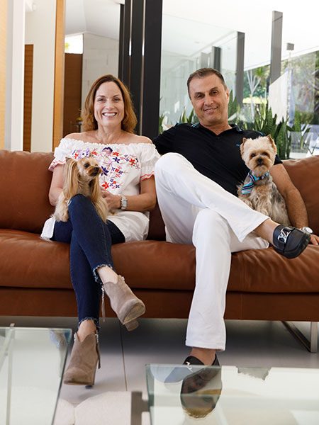
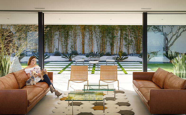
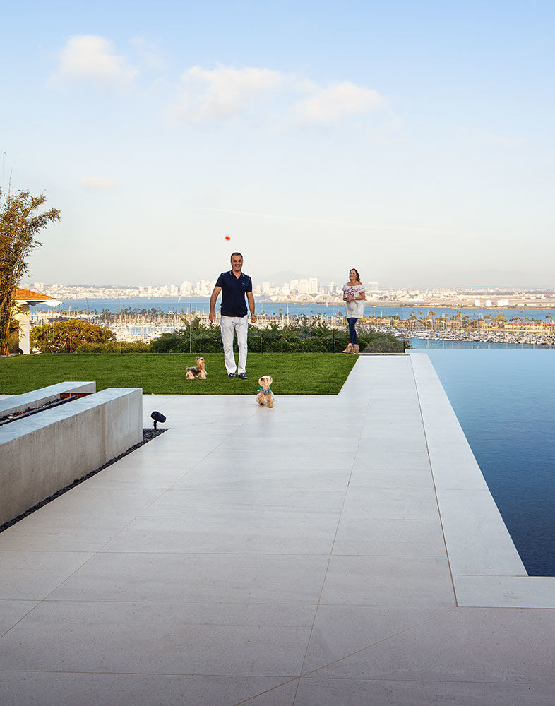
Laila Knight and George Khouli with their dogs, Syria and Rico, styled by Gabriel Feitosa.
It’s four o’clock on a Monday and George Khouli and Laila Knight are right in their happy place: behind the bar.
“What do you want? Open that tequila. We’re having tequila,” Khouli instructs his better half. “Cheers!” Slamming a shot glass on the bar, he declares, “In our house, it’s always happy hour, because it’s a happy home.” It’s also a Lloyd Ruocco home, Knight clarifies. Like Khouli, she’s a bit of an architecture buff. Both immigrants—she from Puerto Rico and he from Syria—the homeowners met over a quarter century ago in San Diego and now own Payless Car Rental together.
Considering the now-open layout and contemporary design, it’s almost inconceivable that their Point Loma stunner was in fact built in 1948 by Ruocco, renowned as one of San Diego’s pioneers of modern architecture. “It gives me chills to think about the mentality of Ruocco back then,” Knight says. “He went way out of the mainstream versus what other architects were doing in San Diego.”
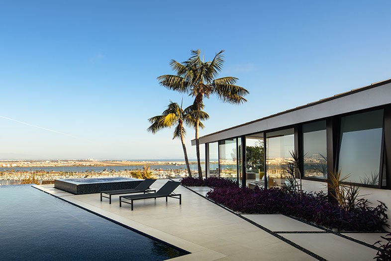
Walnut accent walls, clean lines, and a narrow layout all harken to the era when Ruocco built the 4,500-square-foot home. But it was his choice to wrap the house in glass—every single exterior wall is clear from floor to ceiling—that went against the grain, all in the interest of the real selling point: the view. Khouli stands in the kitchen and gestures out. “No matter how you look, the sun won’t hit you. This is my downtown view here, my ocean view here, my bridge view here. I see cruise ships and I wave.”
Point Loma glass house
Symmetric as can be, the living room is anchored by two Axel leather sofas from Montis, PK22 wicker chairs from Fritz Hansen, and a Circulos Wool Rug by Gandia Blasco.
By the time he stumbled on the three bedroom, four bath in 2015, the view was about the only thing to its credit. “This house was like a diamond in the rough,” he says, noting it was merely a rental property at the time. “I saw the potential, the way the lot was situated, the architecture, that indoor-outdoor feel. It had the bones.”
The Glass House on Point Loma
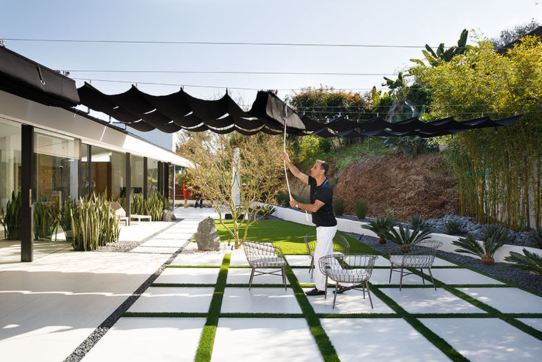
In the backyard, Khouli pulls back a few shades, installed originally to tone down glare from the white tiling.
He and Knight interviewed what seemed like countless architects throughout Southern California until they landed on their dream team in Jesper Pedersen, a Danish architect and founder of DNA Design Group, and Richard Risner, principal landscape architect at Grounded Modern Landscape Architecture. Over three years, they put the modern back into the midcentury home while maintaining the integrity of Ruocco’s original structure.
The Glass House on Point Loma
Powder-blue egg chairs in the kitchen offer another spot to soak up the view.
Pederson used such a subtly diverse palette that he coined the project “50 Shades of White” and focused on simplicity in the details and accents. That attention can be seen in elements like recessed lighting, a 3D accent wall, dotted tiling in the guest bathroom, and even a TV that pops up from the floor in the living room.
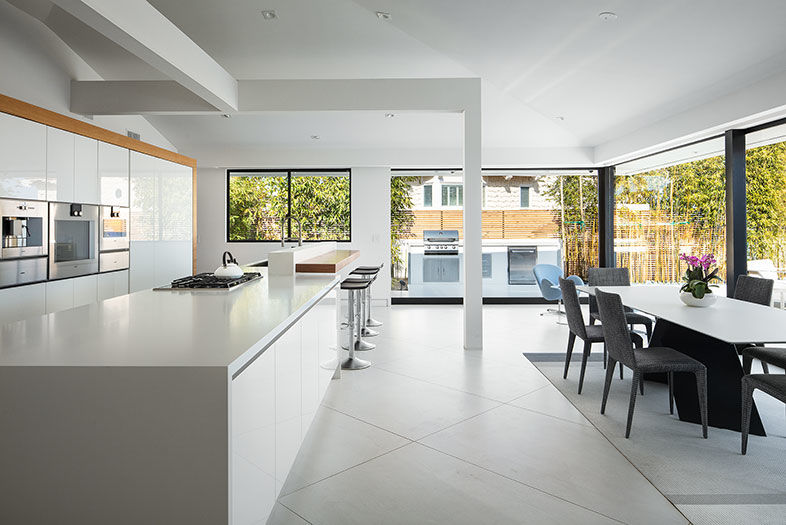
Structurally, opening the layout was his first order of business. He started in the kitchen, ripping out an unassuming cooking area. He replaced it with a 22-foot-long island and installed sleek cabinetry and appliances behind it.
The Glass House on Point Loma
The kitchen’s open layout, including a stark white island and cabinetry balanced out by black bar stools and a dining table and chairs, all by Bonaldo.
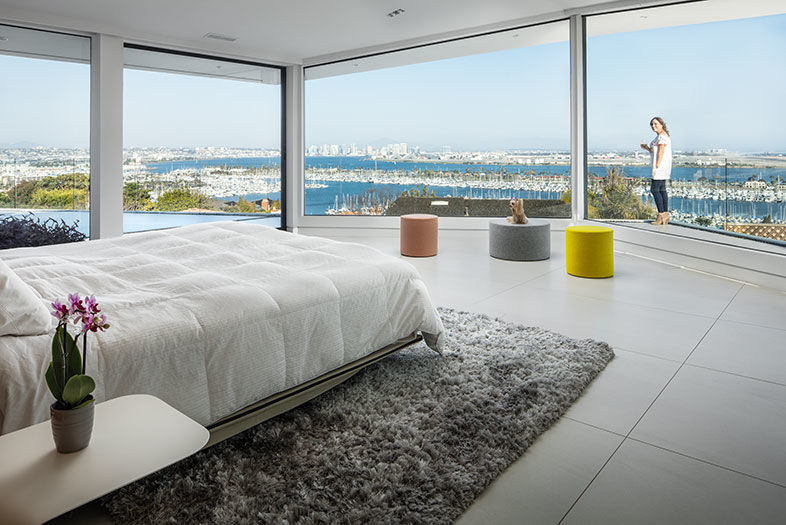
On the opposite wing of the house—”This place keeps us young, because we’re in shape from running from one room to the next,” Knight jokes—and through a living room that bridges the backyard and front yard, the master bedroom also got an open-layout overhaul. What was once a “dinky room,” as Knight puts it, now has sliding glass doors instead of walls, and a mere partition separating the bedroom and the master bathroom. The bathroom too has clear exterior walls, and blackout curtains for privacy.
The Glass House on Point Loma
Panoramic views continue in the master bedroom, where three Blu Dot Bumper Ottomans from Hold It lend a pop of color to the space.
“Don’t get me wrong, you can feel like a fishbowl on display,” Knight admits. “In reality, we have a lot of privacy.” That’s thanks to the property’s location 30 feet above street level—further supporting that gorgeous view—and a perimeter of bamboo Risner installed for additional seclusion.
The Glass House on Point Loma
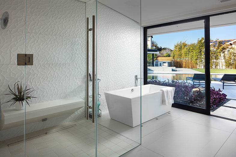
The master bathroom teems with textured tiles.
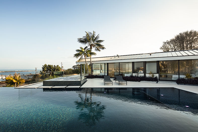
From the start, he and Pederson worked hand-in-hand to ensure the interior and exterior were as identical and modern as possible. They replaced several of those glass walls with sliding glass doors for an open flow, and they used the exact same Pietro Bianco tile inside and out. There’s a more textured version for safety around the infinity-edge pool, which runs right up to clear fencing for an uninterrupted view.
Risner also ensured the outdoor areas were an extension of the indoors by adding a barbecue off of the kitchen, a terrace and fire pit near the dining area, and seating aplenty in the backyard right by the family room where the bar is. “It’s basically creating a house on the outside of your house,” he explains.
Point Loma glass house
The homeowners enjoy a game of fetch with their pups on the artificial front lawn.
As for the interior design, the homeowners trusted only themselves with seeing through their minimalist-meets-modern aesthetic, which meant that one element would be stripped entirely—artwork. There’s not a lick of it in the house. “When you have this kind of gift,” Khouli says, “you want to minimize the interior as much as possible, because you don’t want it to take away from the outside elements.”
Paraphrasing Ruocco’s own philosophy, Knight adds, “This is your artwork: your landscape, your view.”
Point Loma glass house
An exterior view of the master bedroom.

The Glass House on Point Loma
PARTNER CONTENT
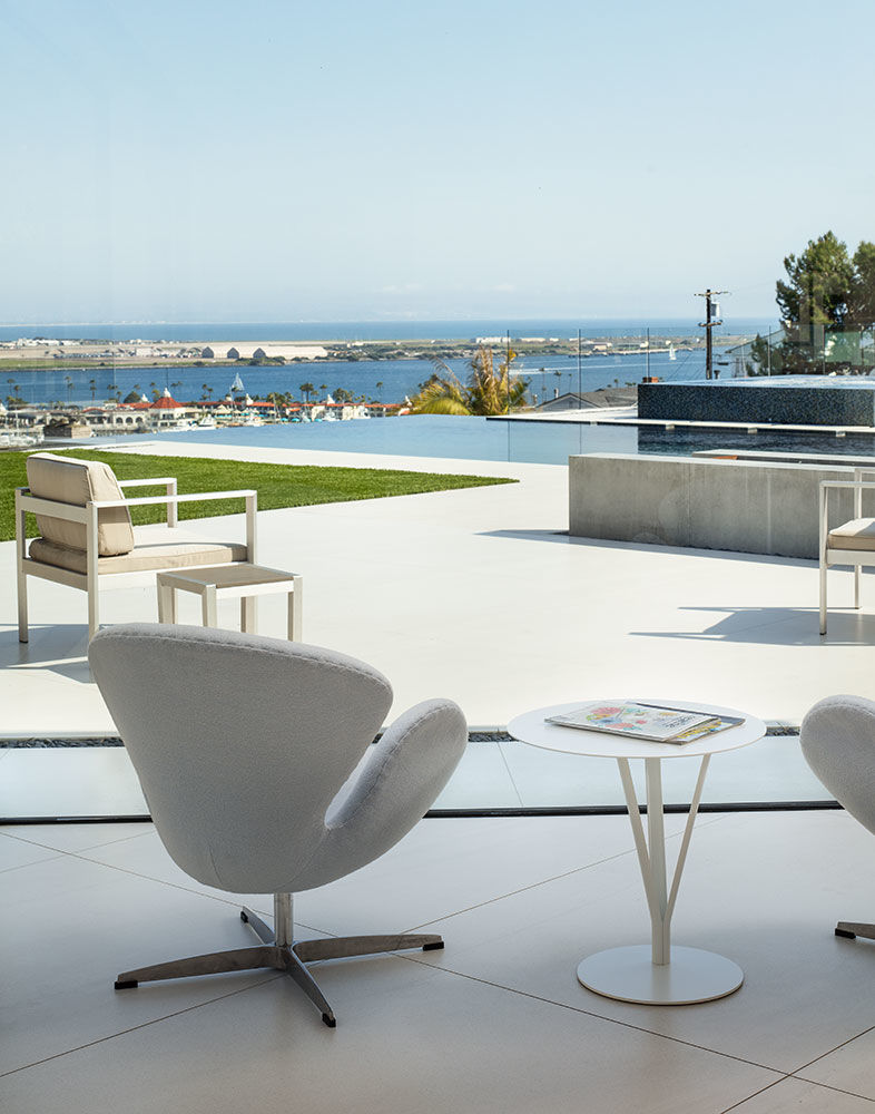
From the front yard, there are views of the bay, North Island, and beyond Zuñiga Point, the Pacific Ocean.
