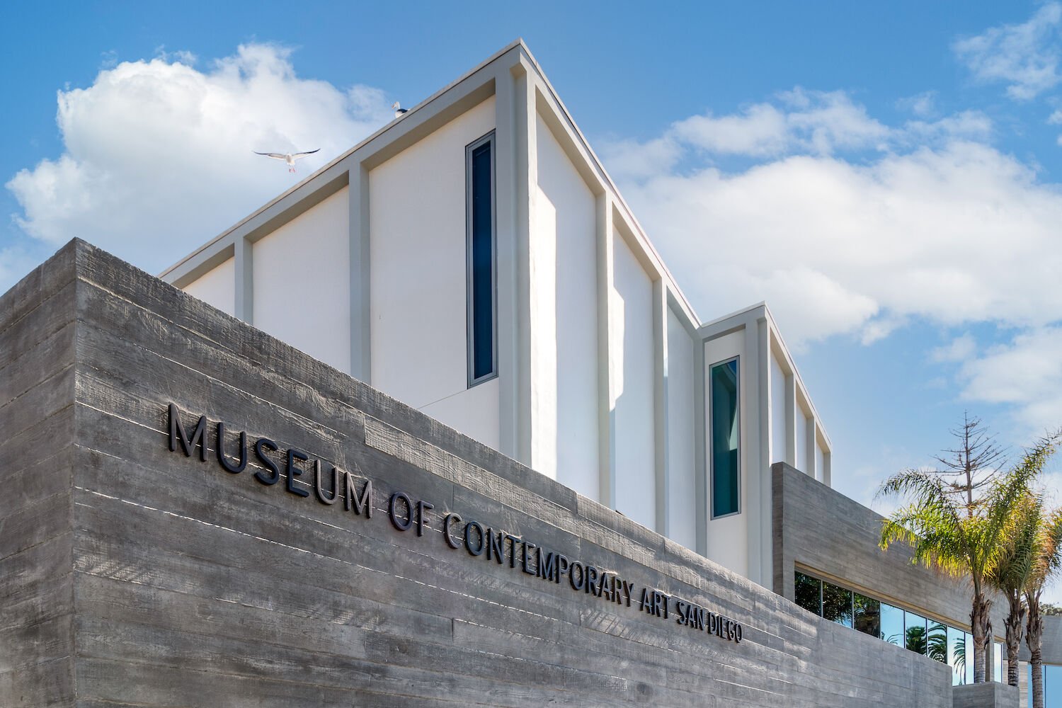
Much like the architects who worked on the museum’s previous redesigns, Annabelle Selldorf incorporated existing architectural features into the reimagined space. The property doubled in size and nearly quadrupled its gallery spaces, making room for both permanent and special exhibits.
Studio Maha
There’s no wrong turn inside the Museum of Contemporary Art’s La Jolla flagship. The new floor plan of the modern, massive, four-year expansion naturally guides you down a “choose your own art adventure,” across spacious maplewood and concrete floors, past airy special exhibit halls and quiet side rooms, before a large-scale Warhol and across to a Lichtenstein. Around 200 works of art are on display—and that’s not even counting the windows on the ocean, which the museum’s previous incarnation lacked.
Architect Annabelle Selldorf’s guiding principle was to maximize the museum’s gallery space and seamlessly blend it with the existing structure and its environment. There’s no better example of that than the reimagined entry, now on the east side of the building. It’s bright, with floor-to-ceiling windows that hug the museum’s Moreton Bay fig tree, and it’s design driven—Italian travertine panels line the building’s exterior and continue into an interior wall of the reception, bringing the outside in. Elsewhere, more rooms were carved out (the property doubled in size and nearly quadrupled its gallery spaces), ceilings were lifted (some top off at 20 feet), and custom-made elements add subtle wow moments, like the floating interior staircase made of precast concrete slabs that were pieced together like a puzzle.
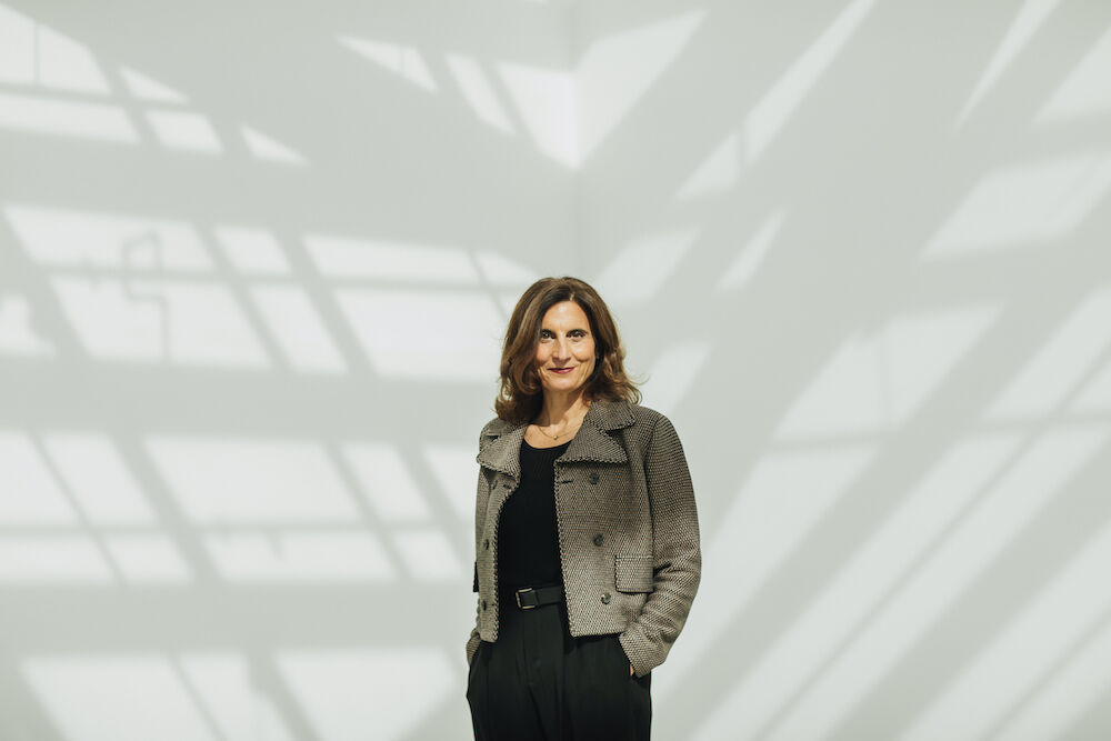
Director and CEO Kathryn Kanjo
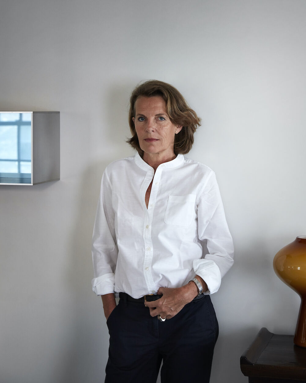
Architect Annabelle Selldorf
Most of all, the museum recognizes place more than ever before. Almost every room has a peek to the outside: On one end, it may be the tall, narrow windows or floor-to-ceiling ones that overlook the passersby on Prospect Street; on the other, the ocean acts as the background art as you make your way through each room.
Director and CEO Kathryn Kanjo sees it as a reorientation. “The building is designed to invite you in,” she says. “But there are all of these different moments to reestablish yourself once you’re in the space, whether it’s noticing the village you just walked in from or stepping out onto one of the terraces overlooking the ocean.”

The museum’s new entry is located on the east side of the building, facing Prospect Street, with floor-to-ceiling windows and Italian travertine panels along the walls both inside and out
Studio Maha
Much like the architects who worked on the museum’s previous redesigns, Selldorf incorporated existing architectural features, using what was already there in a way that still feels cohesive. In that sense, the renovation feels like an ode to the museum’s 80-year history (most of it woman-run)—and its future, as it encourages visitors to not only view art in a traditional sense, but to really be a part of it. Look to the former parking lot, which is now a peaceful outdoor public art space with gathering points tucked in throughout.
“The beauty is that you can have your experience with the individual artwork, but you can also come here to seek out an artful respite, a place for reflection,” says Kanjo.
“It’s an intellectual experience and a connecting experience, for yourself and to share with others.”
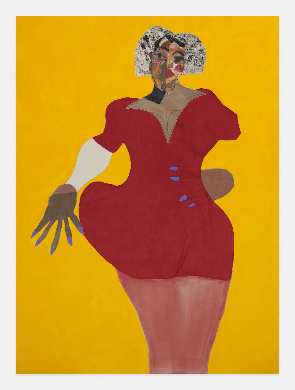
Tschabalala Self, Evening, 2019
PARTNER CONTENT
She adds that the museum can now have its permanent collection on display alongside special exhibitions; previously, they only had room for one or the other. Come April, when the doors officially reopen, you can see that harmonious relationship at work in the special exhibit Niki de Saint Phalle in the 1960s.

