Should it Stay or Should it Go: Vintage Page
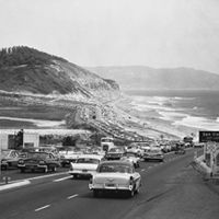
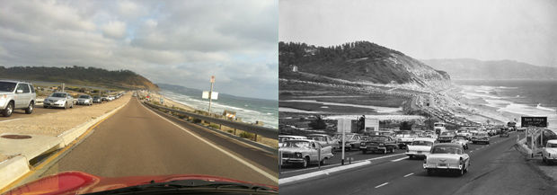
San Diego Historical Society (right)
Can I take your pulse for a minute? I am staring at this month’s Vintage page, in which we run an old photo of some place in San Diego, and then give a little history. I love it. It’s fun to research and I like learning about my city. …It never gets old, heh heh.
But I’m second-guessing the decision to include a feature like this. A black-and-white image with text that is essentially old news feels somehow, well, dated in a magazine that focuses on what to do this weekend and where to go and what to eat.
This month’s subject, Highway 101 looking down on Torrey Pines State Reserve, is a very familiar, beloved view for me. This is the area I grew up in. When I saw this historical image, I was shocked at how different everything looked (yet was still recognizable). I mean, four traffic lanes! At first, my editor Erin gave a little Kayla Maroney—not impressed.

Should it Stay or Should it Go: Vintage Page
So, do we keep the page? Is it cool? As we used to say at Glamour, is Vintage a DO or a DON’T?
Secondly, if it’s a DO, should we show the present day image? I always love a Before & After, but if everyone knows what it looks like now, the image might be superfluous. Also, the black-and-white looks even more ancient and so-last-century when next to a modern-day pic.
Thoughts? As always, I appreciate your feedback!
PARTNER CONTENT
