One Room – Downtown Condo
Lucianna McIntosh
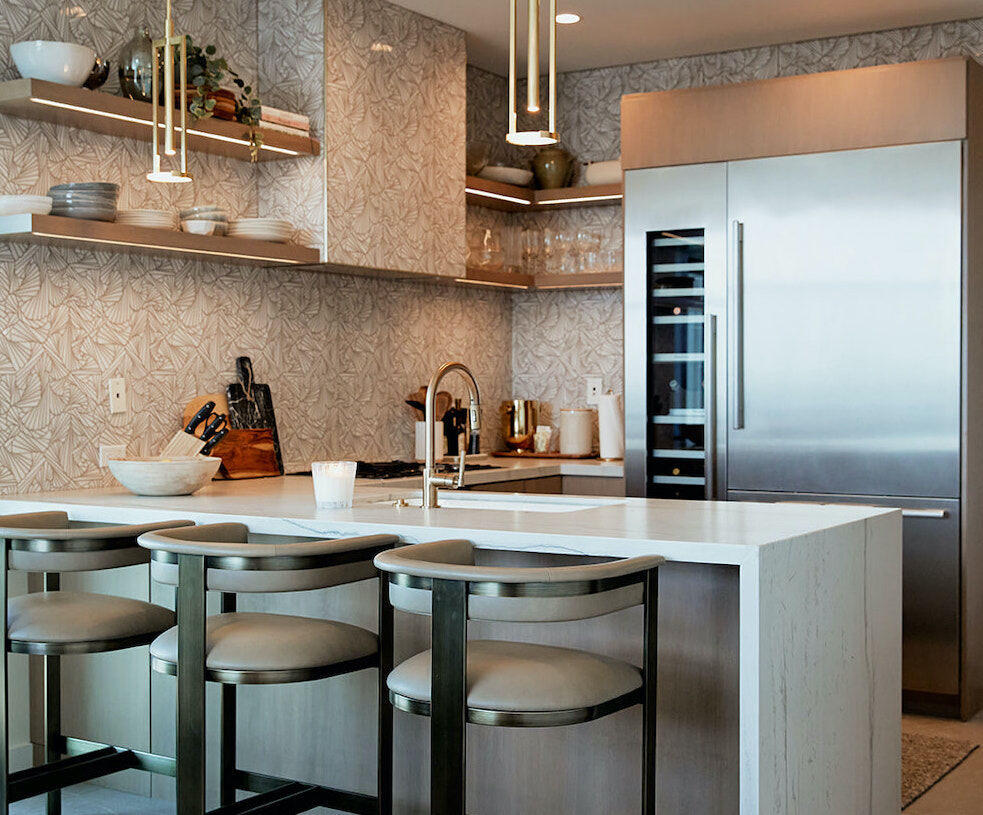
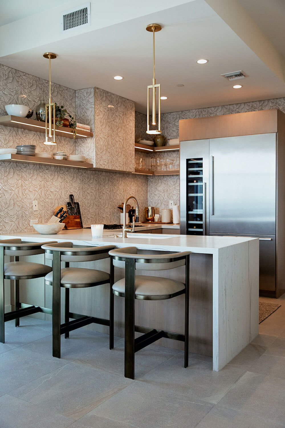
When the couple who had been renting this condo in The Mark building downtown decided to buy it, they brought in Maegan Swabb, owner and lead designer at M. Swabb, to help them maximize every inch and turn their getaway (they also have a home in Idaho) into a place to relax and entertain. Swabb and her team expanded the kitchen, created a bar, and filled the space with metallics, texture, and feminine touches.
One Room – downtown Condo tile
Lucianna McIntosh
Tile Makes a Splash
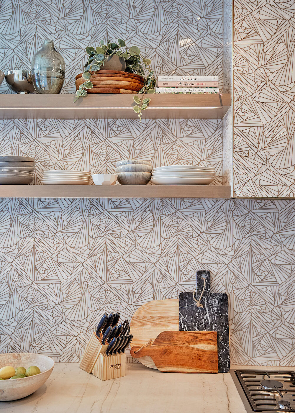
Though it looks like wallpaper, the backsplash that extends to the ceiling is made of white marble mosaic polished stone tiles. “I wanted something to create dimension,” Swabb explains. “This origami, fanlike pattern from Artistic Tile does that and is still easy to clean.” Since a wall of tile can be pricey, she says the same effect can be achieved with a less-expensive vinyl wallpaper, which is moisture resistant and low maintenance. The peel-and-stick versions offer renters an option for jazzing up the kitchen, too.
One Room – Downtown Condo bar
Lucianna McIntosh
Raising the Bar
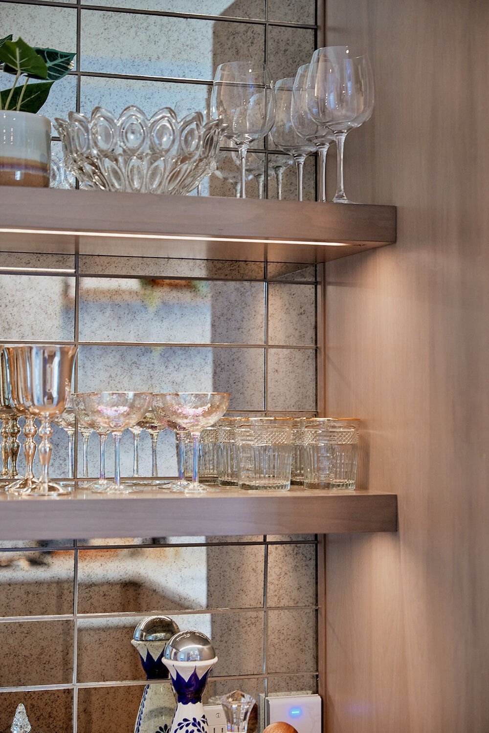
For the couple who frequently hosts, Swabb carved out one corner of the kitchen to create a small bar. Affordable
mirrored subway tiles from Floor & Décor reflect the light and make the nook appear a bit bigger. Floating shelves add storage to display pretty stemware, vintage decanters, and other barware Swabb sourced at various flea markets and consignment shops. “You don’t want the bar to look like you went to one store and bought a whole set of glassware,” she says. “It should appear as though you carefully curated it over time.”
Shelving the Issue
Having everything on display isn’t for everyone, but Swabb says removing upper cabinets in a small kitchen makes a space instantly feel larger. It also ensures you don’t keep stacks of mismatched dishes. “The trick is to add layers,” she says. After she placed the necessities, she added greenery, vases, decorative bowls, artwork, and books of varying dimensions.
The Right Lights
PARTNER CONTENT
General guidelines suggest that pendant lights be hung three feet above an island (or peninsula, in this case) and spaced at least 30 inches apart. Swabb doesn’t necessarily believe in following rules to a T, but says it’s important to consider how a space will be used. Here, lighting creates a mood. Along with a pair of Kelly Wearstler antique burnished brass pendant lights from Circa Lighting, Swabb had each of the floating alderwood shelves hard-wired with under-shelf illumination to add warmth.


